STA130 Spring 2020 - T0206
Michal Malyska
Setup
library(tidyverse)

# For data
library(VGAMdata)
library(insuranceData)

# For reproducibility
set.seed(1337)
Tutorial 1
Agenda:
Intro (10 mins)
Visualization (20 mins)
Group Discussions (35 mins)
Written Evaluation (30 mins)
Intro
Tutorials for this class are mandatory - Total tutorial marks make up 20 % of your grade! Each week, you have the opportunity to gain 6 points: 1 point attendance, 1 point practice problem, and 4 points for the writing/presentation exercise.
Attendance
Attendance is important - not only do you get marks for showing up on time (and only if you show up on time). People who come to tutorials tend to do better on the midterm and poster presentations.
attendance_df %>% ggplot(aes(x = attendance, y = midterm_marks)) +
    geom_point() +
    theme_minimal() +
    geom_smooth(method = "lm") +
    scale_x_continuous(name = "Attendance(%)") +
    scale_y_continuous(name = "Midterm Mark(%)") +
    labs(title = "Attendance and Midterm marks")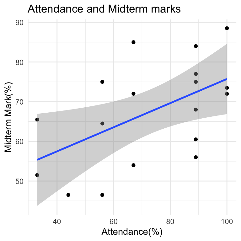
Expectations:
Have questions completed and submitted to Quercus, no emailed homework will be accepted
Tutorial is NOT the place for troubleshooting R code. You should be prepared to discuss your results during tutorial. Instead, go to OH or post questions to the discussion board ahead of tutorial. OH are on Tues, Wed and Thurs.
We use RCloud (do not recommend anything else unless the student is an advanced R user) – all the packages they will need have already been included in the RCloud session.
Respectfully participate in group work and class discussions
Practice their English writing & oral presentation skills, particularly for non- statistician audiences
Show up on time, tutorial starts 10 past the hour and goes until the hour. If you need to miss a tutorial or leave early for a test (10 minutes early MAX), you should let me know ahead of time. Showing up late or leaving more than ten minutes early will result in an attendance score of zero.
Resources
R Studio Cloud can be slow and buggy so I usually recommend to my students setting it up locally. This is by no means necessary for this course but will be required for courses in the future, and will get you more familiar with the setup.
If you are interested in setting it up on your computer you can find a full guide here
Visualizations
What are the most effective types of graphs to summarize information in categorical or quantitative variables?
What does the distribution tell you about for each types of data (categorical or quantitative)?
How do you describe a histogram or a scatterplot? (refer to this week’s vocabulary list at the bottom)
Be mindful of how you present your findings – are you potentially misleading the audience? Is it reader friendly?
Think about the source of the data – this may have important implications for your interpretations!
Questions specific to your homework 1 question:
What type of distribution does the number of pages have?
Is there an association between number of pages and weight? Number of pages and type of cover (hard or paper)?
What types of figures (that we’ve learned so far) would be appropriate for this question? Why or why not?
Group Discussion
What do you notice about the number of bins a histogram has, its shape and precision?
In Question 1d, you could have presented both book cover types (hard or paper) in the same plot or presented them on separate plots. What are some considerations for which presentation you may want to choose (e.g. what are the pros and cons of each one)?
If presenting two plots side by side, what are some things to consider to ensure they are comparable and reader-friendly?
In questions 2 and 3, you saw examples of survivor bias. What is this? How does it impact, for example, the mean survival time calculated in Question 3?
Writing Guidelines
A possible writing template:
Give context to variables you will be discussing (mention the names, what they represent, units / types of values)
Describe the most striking features of the graphs and what they mean. Make a conclusion based on those features
Explain how you that conclusion is supported from the graphs
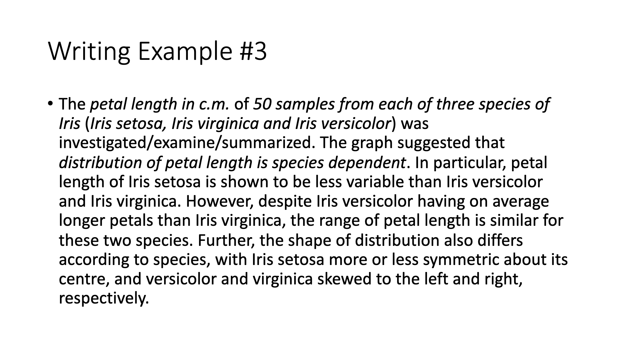
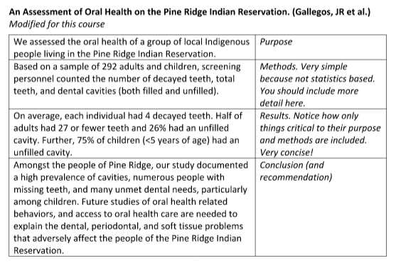
Good writing example:
Written Evaluation
HAND IN BY THE END OF TUTORIAL ON QUERCUS
Write a short paragraph to describe coherently the graphs you produced and structure these graphs to tell an interesting “story” about the data used in Question 1. You should use at least 2 graphs or plots from question 1 to support your story.
Vocabulary
Bar graphs, histograms:
Where are the data centered (towards the left, right, middle)
How much spread (relative to what?)
Shape: symmetric, left-skewed, right-skewed
The tails of the distribution (heavy-tailed or thin-tailed)
Modes: where, how many, unimodal, bimodal, multimodal, uniform
Outliers, extreme values
Frequency (which category occurred the most or least often; data concentrated near a particular value or category)
Scatterplots (bivariate or pairwise scatterplots):
Strong / weak relationship
Linear / nonlinear relationship
Direction of association (positive or negative)
Outliers (deviation from what?)
Any visible clusters forming
Each dot represents …
Tutorial 2
Agenda for today:
Frequent Class Questions
Vocabulary Review
Boxplots
Group Discussion
Written Evaluation
Frequent Class Questions
What is this course really about?
The course is designed such that you are introduced to concepts on Monday and assigned homework problems to work on during the week. Doing the homework allows you to develop hands-on experience with the necessary R code and analytical issues surrounding the analysis of real-world data. After completing the homework, tutorials provide you the opportunity to discuss what you observed. For example, what types of methods did you use, why you used those methods, what you observed, whether your findings fit your expectations, any limitations to your findings, etc. Tutorials also offer a critical opportunity to practice your ability to explain your research – via writing and speaking activities. As much as many of us hate writing or are shy to speak with others, these are critical skills for everybody working in statistics, particularly since we often work in multidisciplinary teams with people who do not have advanced statistical training!
Can we use aids for the written evaluations?
You are allowed these for your writing assignments, including dictionaries, collocations dictionaries, thesauruses, and translator apps. HOWEVER, you should make VERY sparing use of these aids for the following reasons:
Over-use of aids eats up too much of the 30 minutes.
The writing will usually turn out better if the student uses language they already know plus the language we’re teaching them as part of the course.
Thesauruses and translator apps especially often have the effect of introducing errors into the student’s writing. The apps are often poor quality.
As mentioned, the purpose of the course is to strengthen your overall ability to communicate.
Why are we doing so much writing in a stats class?
Many of you have been wondering why we have been focusing so much on writing activities and R code so far in this course. Don’t worry, the entire course won’t be like this. Soon we will move on to oral presentations in tutorial. However, in order to give a great oral presentation, knowing how to first properly structure and word your presentation is key. Also, we first want to make sure you have experience with R code and critical skills, like making figures, before we dive deeper into our stats content.
Why do we only get 30 minutes for the written evaluation?
These are intended to be short exercises, no more than half a page, and are based on the homework you should have (hopefully) already completed. You’ve also discussed these concepts and questions during tutorial. Given all of this, 30 minutes is more than enough time for you to summarize your observations. Besides, writing for any longer than this would probably become boring and would mean less time for covering other important things in tutorial!
Vocabulary Review:
- Mean
Mean (also called an average, simple average, or arithmetic mean) is the sum of all elements divided by the count of all the elements.
\[ \text{mean}(X) = \bar{X} = \frac{X_1 + X_2 + X_3 + \dots + X_N}{N} = \frac{1}{N} \sum_{i=1}^{N}\left( X_i \right) \]
# Vector of integers from 1 to 100
x <- 1:100

# Mean
mean(x)
## [1] 50.5sum(x) / length(x)## [1] 50.5- Median
Median - Median is the special name we give to the 2nd Quartile / 0.5 Quantile. It is the number for which 50% of the data is below it. (Essentially the point that splits your data in half)
median(x)## [1] 50.5- Variance
Variance is the average squared distance of your datapoints from the mean. It measures how much the data is spread out from the mean.
\[ \text{ (sample) }Var(X) = \frac{\sum\left( X_i - \bar{X} \right)^2}{N-1} \]
- Standard Deviation (SD)
Standard Deviation is the average distance (deviation) of datapoints from the mean. It’s also the square root of the variance
\[ \text{ (sample) }SD(X) = \sqrt{\frac{\sum\left( X_i - \bar{X} \right)^2}{N-1}} = \sqrt{Var(X)} \]
sd(x)## [1] 29.01149sqrt(sum((x - mean(x))^2) / (length(x) - 1))## [1] 29.01149sqrt(var(x))## [1] 29.01149- Quartile
Quartiles are a set of numbers that split our dataset into quarters (25%). So:
1st Quartile is the number below which 25% of our data is located 2nd Quartile is the number below which 50% of our data is located (Median!) 3rd Quartile is the number below which 75% of our data is located
- Interquartile Range (IQR)
Interquartile range is just the difference between the 3rd Quartile and the 1st Quartile. This means that the middle 50% of the data lies in that range.
Proportion
Outlier
Outliers are the unusual observations. In this course we define the outlier to be an observation that lies outside of a range. (Which is quite common for large datasets)
\[ \text{Range} = [Q_1 - 1.5\text{IQR}, Q_3 + 1.5\text{IQR}] = \\ = [Q_1 - 1.5(Q_3 - Q_1), Q_3 + 1.5(Q_3 - Q_1)] \]
- Boxplot
Boxplot is a type of plot for numerical data. It shows the median, 1st and 3rd quartiles, the interquartile range, and outliers into a single plot.
Example in the section below
R object
Vector
Variable Types
Data Frame / Tibble
Summary Table
Summary Statistics
Boxplots
When to use boxplots?
When you want to summarize the distribution of a quantitative (numerical) variable. Boxplots visualize five statistics (minimum, maximum, median, 1 st quartile and 3 rd quartile), while also plotting unusual observations (outliers). You can also use a boxplot to summarize these vales according to a categorical variable of interest.
Example: height of athletes, a continuous variable, can be visualized using a boxplot. You may also want to show how this distribution varies by important categorical variables, such as: sport, country of origin, sex, etc.
How:
# Load the data as tibble (not necessary)
df <- as_tibble(oly12)

# Make a boxplot:
df %>%
    ggplot(aes(x = Sport, y = Age)) +
    geom_boxplot() +
    coord_flip() +
    theme_minimal()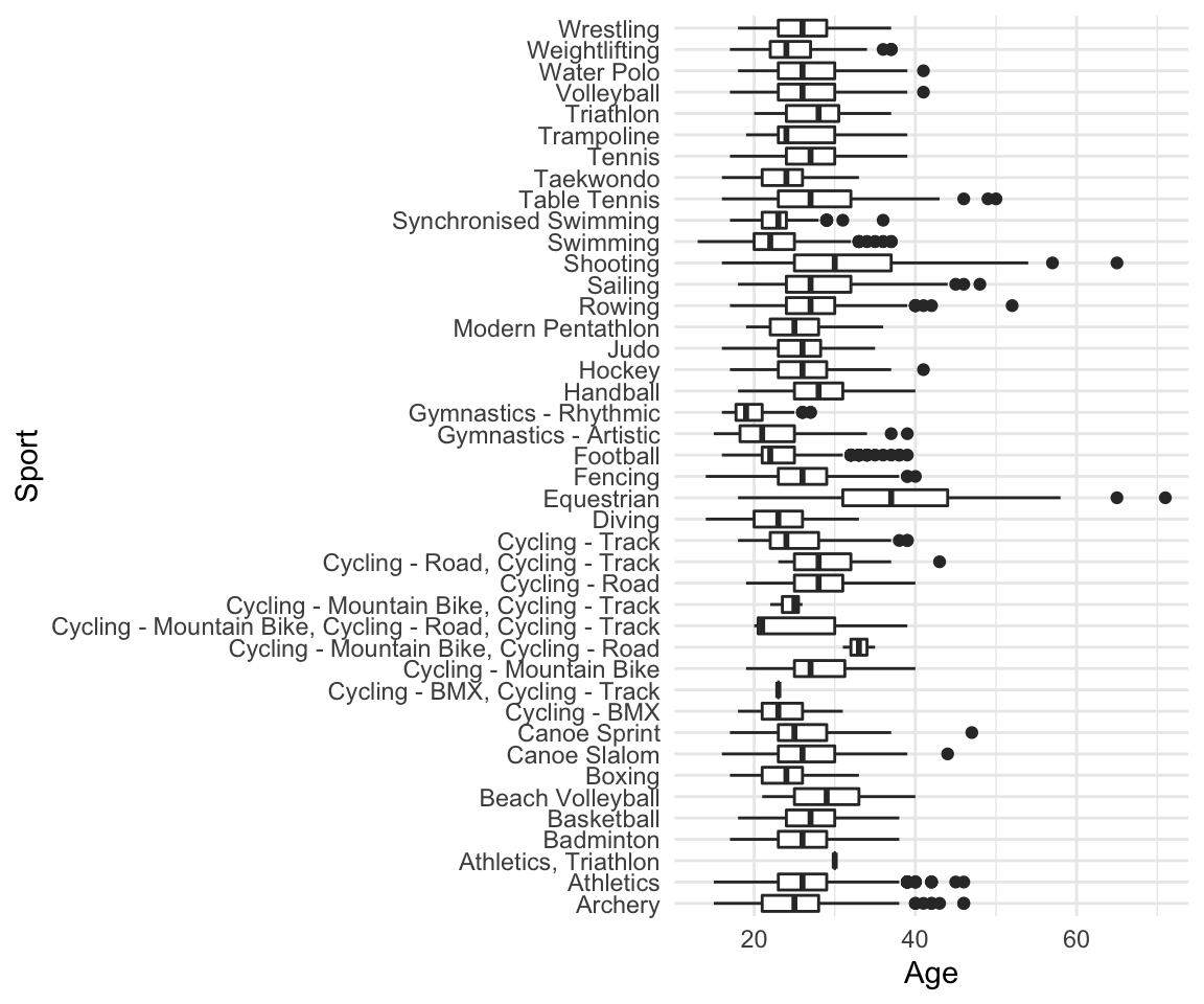
Limitations: Boxplots are nothing more than visualizations of a couple of numbers which means they do not give the full picture of your data. If you would like to know about a (better in my opinion) alternative - Violin plots, read the section at the end of this tutorial (THIS IS OPTIONAL)
Group Discussion
- For Question 1, you used both histograms and boxplots to visualize your data. Which features were easier/harder to observe from each of the visualizations? In what situations may you want to choose a boxplot over a histogram, or vice versa? Explain.
temp_df <- read_csv("datafiles/temp_Jan17.csv")## Parsed with column specification:
## cols(
## city_name = col_character(),
## temperature = col_double(),
## decade = col_character()
## )ggplot(data = temp_df, aes(x = temperature)) +
geom_histogram(color = "black", fill = "gray", bins = 30) +
theme_minimal() -> p1
ggplot(data = temp_df, aes(x = "", y = temperature)) +
geom_boxplot() +
theme_minimal() -> p2
gridExtra::grid.arrange(p1, p2, ncol = 2)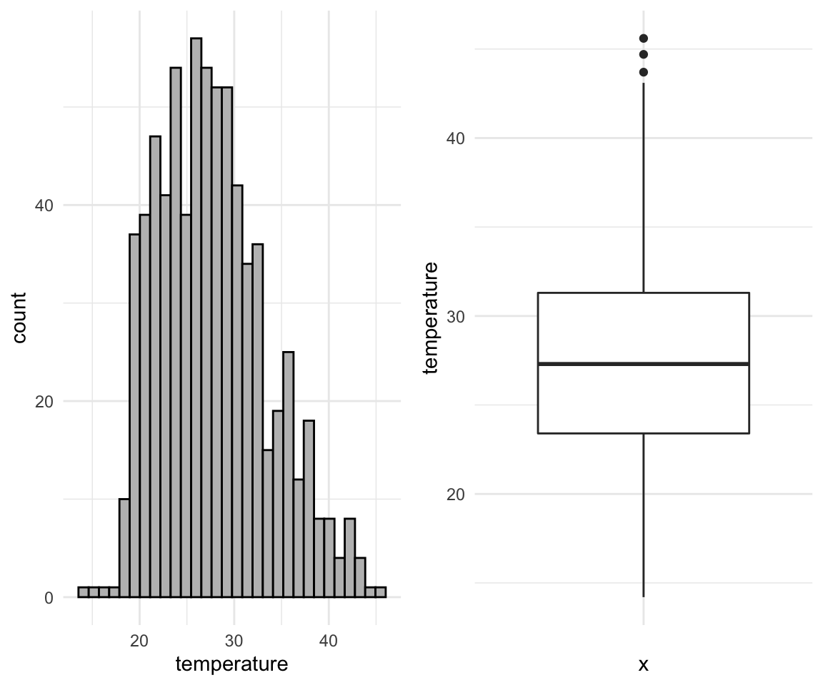
- Based on your plot in Question 2d, can you determine if the same number of rainfall observations were recorded each decade? Why or why not?
ggplot(data = temp_df, aes(x = city_name, y = temperature)) +
    geom_boxplot() +
    theme_minimal()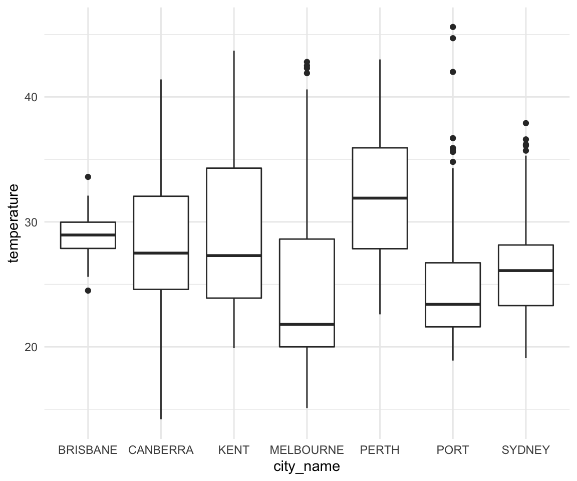
- Why might it be useful to provide a summary table? (You made one in Question 2h)
rain_df <- read_csv("datafiles/rain_Jan17.csv")## Parsed with column specification:
## cols(
## city_name = col_character(),
## rainfall = col_double(),
## decade = col_character()
## )ggplot(data = rain_df, aes(x = rainfall)) +
geom_histogram(color = "black", fill = "gray", bins = 30) +
theme_minimal() -> p1
ggplot(data = rain_df, aes(x = "", y = rainfall)) +
geom_boxplot() +
theme_minimal() -> p2
gridExtra::grid.arrange(p1, p2, ncol = 2)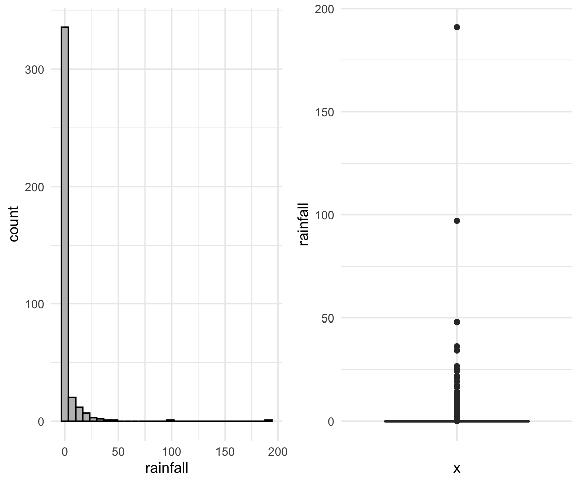
Written Example number 2
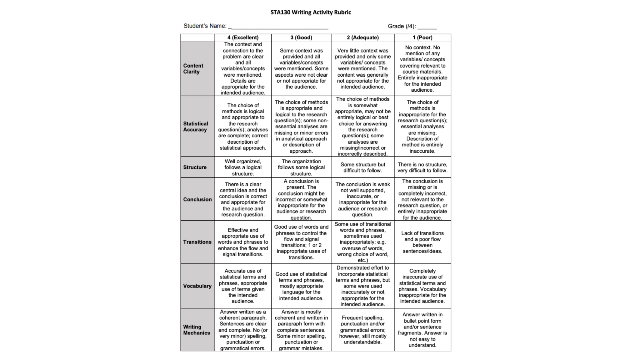
Remember that you are graded using this rubric!
Written Evaluation
Imagine you’ve been hired as a statistical consultant for CP24, a local news station. They’ve asked you to put together a short report based on your recent research regarding historical temperatures and rainfall in Australia (practice problem questions 1 and 2). Your boss has asked you to deliver a short, written summary of your most interesting research findings. They want this by the end of the day because they’d like to include them in the 6pm news report. It’s already 3:30 pm and it’s a Friday!
Remember, the newsroom is a busy place. They only want the most important information and they don’t want to read more than half a page of text. Use visuals to help get key points across, if you can. The news team has only limited statistical background, so make sure everything is clear and makes sense! Remember to start with the purpose – the team is busy with so many news stores and they may have forgotten exactly what your research was about! Also make sure to include a complete, but concise, summary of the methods, key results, and a conclusion.
Remember, you’re the statistics expert and the team are counting on you to summarize this research!
SUBMIT TO QUERCUS
Additional Resources
Violin Plots:
In addition to plotting just the summary of data which underlies the boxplots, violin plots provide an overview of how the data is spread along that axis. A side by side comparison of the two is below.
# Boxplot
rain_df %>%
    filter(city_name == "Sydney") %>%
    ggplot(aes(x = city_name, y = rainfall)) +
    geom_boxplot() +
    theme_minimal() +
    labs(title = "Boxplot") -> p1
## filter: removed 274 rows (71%), 110 rows remainingrain_df %>%
filter(city_name == "Sydney") %>%
ggplot(aes(x = city_name, y = rainfall)) +
geom_violin() +
theme_minimal() +
labs(title = "Violin Plot") -> p2## filter: removed 274 rows (71%), 110 rows remaininggridExtra::grid.arrange(p1, p2, ncol = 2)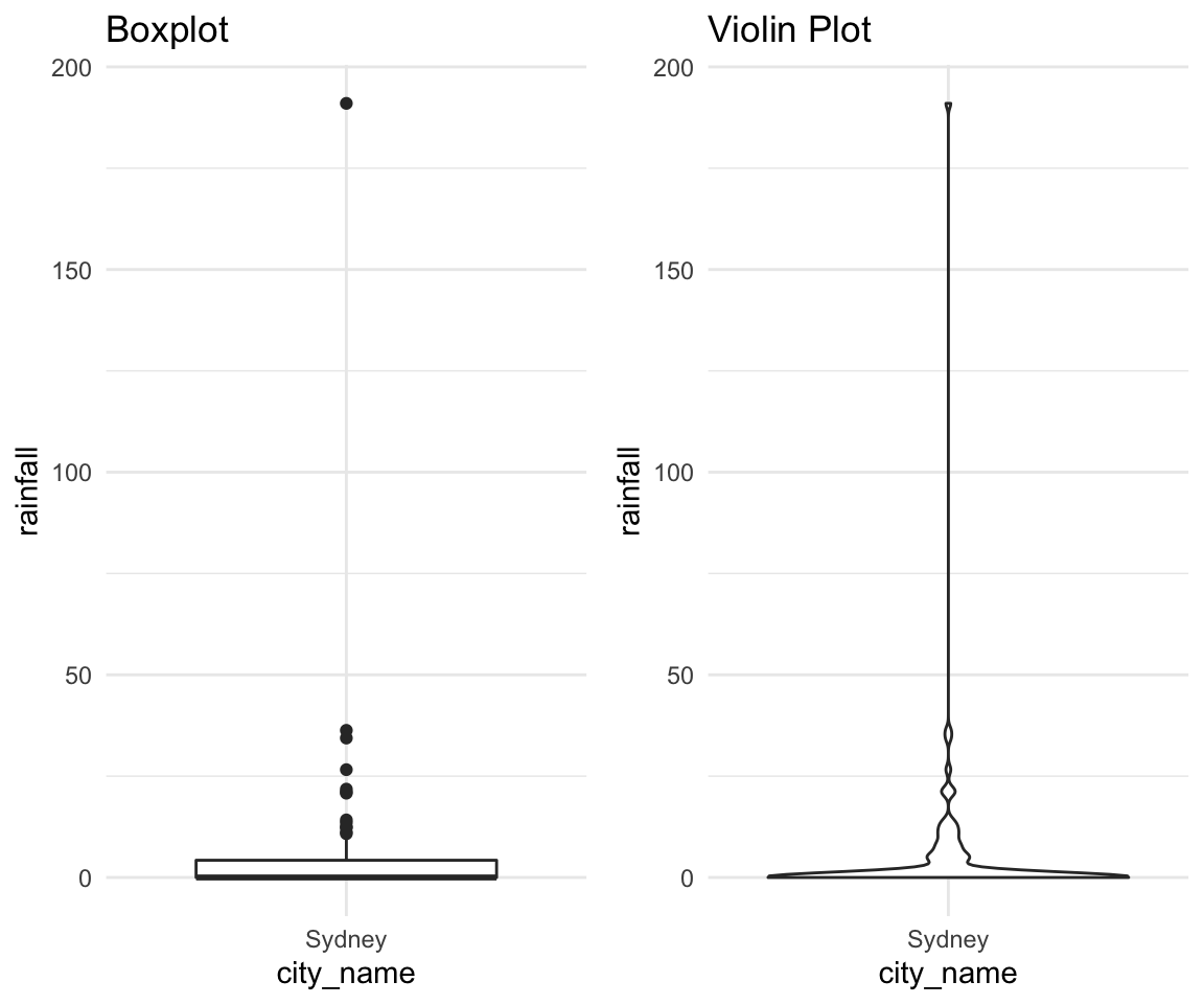
rain_df %>%
    filter(city_name == "Sydney") %>%
    ggplot(aes(x = city_name, y = rainfall)) +
    geom_violin() +
    geom_boxplot() +
    theme_minimal() +
    labs(title = "Combined Plot")
## filter: removed 274 rows (71%), 110 rows remaining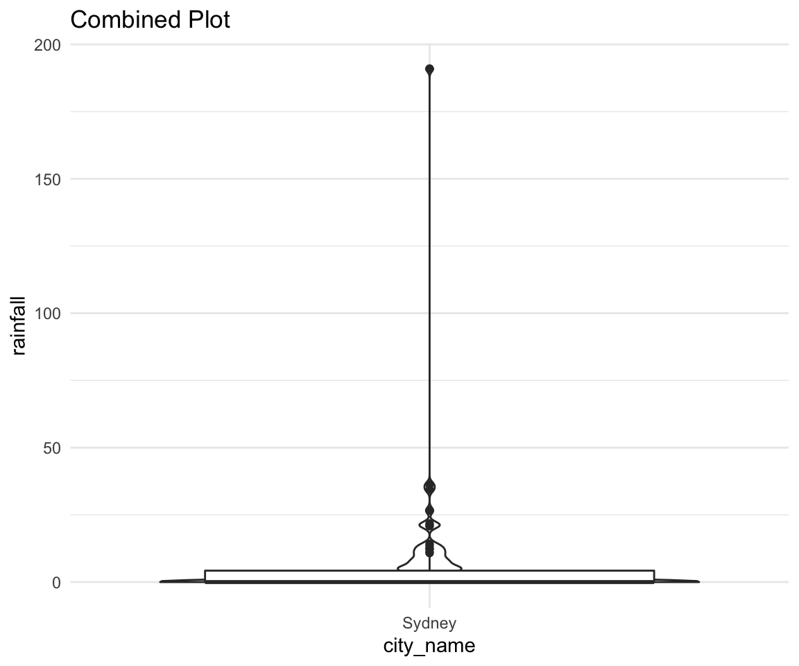
Tutorial 3
Agenda:
Vocab and code review
Discussion
Written Evaluation
Mentorship
Vocab
Cleaning data
df <- as_tibble(oly12)
df <- df %>% janitor::clean_names()
# janitor::row_as_names()
Tidy data
Removing a column
names(df)## [1] "name" "country" "age" "height" "weight" "sex"
## [7] "dob" "place_ob" "gold" "silver" "bronze" "total"
## [13] "sport" "event"df <- df %>% select(-dob)## select: dropped one variable (dob)names(df)## [1] "name" "country" "age" "height" "weight" "sex"
## [7] "place_ob" "gold" "silver" "bronze" "total" "sport"
## [13] "event"Extracting a subset of variables
names(df)## [1] "name" "country" "age" "height" "weight" "sex"
## [7] "place_ob" "gold" "silver" "bronze" "total" "sport"
## [13] "event"df_subset <- df %>% select(name, age, height, weight)## select: dropped 9 variables (country, sex, place_ob, gold, silver, …)names(df_subset)## [1] "name" "age" "height" "weight"Filtering the data frame based on a condition (e.g. based on the values in one or more of the variables/columns)
df_filtered <- df %>% filter(height > 1.6)## filter: removed 1,251 rows (12%), 9,133 rows remaining# Some vector of names
names <- c("", "", "", "")
df_filtered <- df %>% filter(name %in% names)## filter: removed all rows (100%)Sorting data based on the values of a variable
# ascending
df_sorted <- df %>% arrange(age)
# descending
df_sorted <- df %>% arrange(-age)
Renaming the variables
names(df)## [1] "name" "country" "age" "height" "weight" "sex"
## [7] "place_ob" "gold" "silver" "bronze" "total" "sport"
## [13] "event"df <- df %>% rename(place_of_birth = place_ob)## rename: renamed one variable (place_of_birth)names(df)## [1] "name" "country" "age" "height"
## [5] "weight" "sex" "place_of_birth" "gold"
## [9] "silver" "bronze" "total" "sport"
## [13] "event"Defining new variables
df <- df %>% mutate(bmi = weight / height^2)## mutate: new variable 'bmi' with 1,903 unique values and 13% NAProducing new data frames
# df_new <- function(df_old)Handling missing values (NAs)
df <- df %>% filter(!is.na(bmi))## filter: removed 1,346 rows (13%), 9,038 rows remainingGrouping categories
df <- df %>% group_by(sport)## group_by: one grouping variable (sport)Creating summary tables
# Passing an already grouped tibble!
df_summary <- df %>% summarize(
    mean_bmi = mean(bmi),
    n = n()
)
## summarize: now 36 rows and 3 columns, ungroupedDiscussion
Why is data visualization so important?
Why does your audience matter? (Think about what message you want to portray and the types of data/ visualizations that you’ll use)
Why is it important for data visualizations to be intuitive? How can you ensure your figures are intuitive to the intended audience?
What might happen to a data visualization project if you failed to clean the data?
Written Evaluation
Self Reflection (30 Minutes):
Q1. What questions, if any, do you have so far regarding the course materials?
Q2. What is one of your favorite things about tutorial?
Q3. What is one of your least favorite things about tutorial? (Other than it being on a Friday!)
Q4. What is the thing you are most looking forward to for the mentorship program?
SUBMIT TO QUERCUS
Mentorship
Tutorial 4
Agenda:
About Office Hours
Vocab Review
Group Discussions
Oral Presentations
RStudio Cloud Problems
Office Hours
Office hours (OH) are one of the best resources to help with conceptual questions. They are usually quite empty so if you would like to get 1 on 1 time to ask questions and seek help from one of the TAs you should go! Piazza is good for R questions and debugging problems, but if you are really struggling it might be helpful to have a TA look at your code and walk you through what’s going wrong.
Office hours are incredibly important before poster presentations. You should aim to have most of your analysis done a few days ahead of the deadline, then you should either message me with a short summary with what you did or go to TA office hours and walk them through what you did. This will help you avoid making simple errors that can result in you losing a lot of marks on the posters.
Office hours get incredibly crowded the week before any major coursework - midterm posters and final. It’s worth going 2 weeks early and having 1-on-1 time with TA’s instead of coming the week before and having to wait in a line of 10 people.
Vocab Review
How to interpret a p-value? Misinterpreting p-values is a very common mistake – even one made by senior researchers! In technical terms, a p-value is the probability of obtaining an effect at least as extreme as the one in your sample data, assuming the truth of the null hypothesis. For example, suppose that a vaccine effectiveness study produced a p-value of 0.04. This p- value indicates that if the vaccine had no effect, you’d obtain the observed difference or more in 4% of studies due to random sampling error. Critically, p-values address only one question: how likely are your data, assuming a true null hypothesis? It does not measure support for the alternative hypothesis.
What Doesn’t a p-value Mean? Statistical significance does not mean practical significance. The word “significance” in everyday usage connotes consequence and noteworthiness. Just because you get a low p-value and conclude a difference is statistically significant, doesn’t mean the difference will automatically be important. For example, a large clinical trial investigating a new weight loss drug found that people who took their drug loss 0.1 pounds more over the course of a year compared to those who took their competitor’s drug (p=0.0001). While this is a statistically significant difference, it’s likely not clinically meaningful. Statistically significant just means a result is unlikely due to chance alone!
Other important facts:
P-values are almost never zero - If R shows you an exact zero this means you are not looking at enough digits. You should say something like \(p < 0.0001\) or \(p \approx 0\) never \(p = 0\)
You can never accept the alternative hypothesis. You only reject or fail to reject the null hypothesis. This is the most common error in written assignments.
In the vast majority of cases in statistical analysis you will be using the threshold of $ p = 0.05 $. If \(p > 0.05\), then the chance of observing your outcome due to chance alone was greater than 5% (5 times in 100 or more) under you null hypothesis. In this case, you would fail to reject the null hypothesis and would not accept the alternative hypothesis.
Evidence of statistically significance is either present or it’s not. Never say that something is “almost” statistically significant.
Group Discussions
For Question 1, what would you expect to happen your p-value if you used 10 simulations versus 10,000 simulations? Explain.
run_simulation <- function(repetitions) {
    simulated_stats <- rep(NA, repetitions)
    n_observations <- 500
    test_stat <- 63 / n_observations

    for (i in 1:repetitions)
    {
        new_sim <-
            sample(
                c("Left", "Right"),
                size = n_observations,
                prob = c(0.1, 0.9),
                replace = TRUE
            )
        sim_p <- sum(new_sim == "Left") / n_observations
        simulated_stats[i] <- sim_p
    }
    sim <- tibble(prop_Left = simulated_stats)

    plot <- ggplot(sim, aes(prop_Left)) +
        geom_histogram(bins = max(floor(sqrt(repetitions)), 10)) +
        geom_vline(xintercept = test_stat, color = "red") +
        geom_vline(xintercept = 0.1 - (test_stat - .1), color = "red")

    summary <- sim %>%
        filter(prop_Left >= test_stat | prop_Left <= 0.1 - (test_stat - 0.1)) %>%
        summarise(p_value = n() / repetitions)

    return(list(plot, summary))
}

run_simulation(10000)
## filter: removed 9,376 rows (94%), 624 rows remaining## summarise: now one row and one column, ungrouped## [[1]]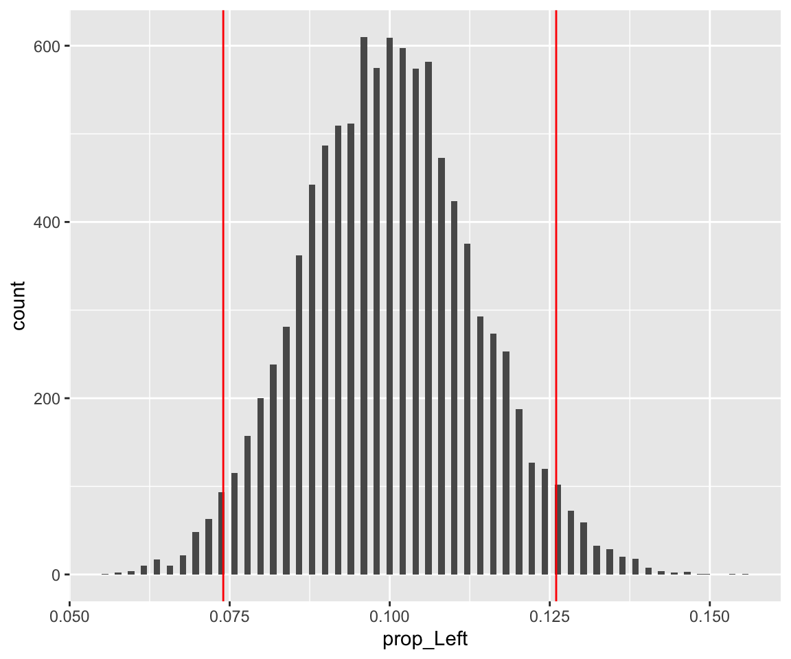
##
## [[2]]
## # A tibble: 1 x 1
##   p_value
##     <dbl>
## 1 0.0624run_simulation(10)## filter: removed 9 rows (90%), one row remaining
## summarise: now one row and one column, ungrouped## [[1]]
##
## [[2]]
## # A tibble: 1 x 1
##   p_value
##     <dbl>
## 1     0.1
Approximately 10% of the general population is left-handed. Suppose that the university is conducting a study to see if this percentage is the same among their students. This would help inform classroom renovations to ensure sufficient left- handed (and right-handed) seating. Suppose 500 students are randomly selected and asked whether or not they are left-handed. Suppose that 63 of these 500 students respond that they are left-handed. Say you used R to estimate the sampling distribution of the test statistic under the assumption that the prevalence of left-handedness among University of Toronto students matches the general population and you computed the p-value of the above hypothesis test based on this sampling distribution.
Which of the following statements is/are valid description of the P-value you computed?
The probability that the proportion of U of T students who are left-handed matches the general population.
The probability that the proportion of U of T students who are left-handed does not match the general population.
The probability of obtaining a number of left-handed students in a sample of 500 students at least as extreme as the result in this study.
The probability of obtaining a number of left-handed students in a sample of 500 students at least as extreme as the result in this study, if the prevalence of left- handedness among all U of T students matches the general population.
Oral Presentations
Prepare a 5-minute presentation summarizing the one of your major research findings from Question 2. You can pretend you’ve been asked by the Chair of the Dept of Statistical Sciences to present your work at the next faculty meeting. Your oral presentation, like a written summary, should include the following components:
Contextualize the problem (Data introduction)
Summarize the methods. E.g. State hypotheses; define the test statistic; etc.
Summarize your findings
Conclusion
Limitations (optional, but good practice). E.g. sample size, study design issues, etc.
Additional Resources for coding:
The best way to become familiar with how to write code in R is to practice and do some simple data analyses. If you would also like too see what the process from getting data to analysis looks like there is a weekly live coding session called Tidy Tuesdays done by David Robinson. They come out to about 90 minutes, and I think it would be very beneficial to you if you watched one and tried to follow along with some of the commands. An example can be found here
Additional Resources - the “Why” of data visualization
Let’s begin with a short exercise - I have loaded 13 new datasets into my memory. They are all simple and contain 142 observations each of 2 variables - x and y. I will begin by just looking at some data summaries that we typically look at in this class. Mean, standard deviation, and correlation of the two variables.
library(datasauRus)
df <- datasaurus_dozen %>%
    mutate(ID = as.integer(as_factor(dataset))) %>%
    dplyr::select(-dataset)
## mutate: new variable 'ID' with 13 unique values and 0% NAdf %>%
group_by(ID) %>%
summarize(
mean_x = mean(x),
mean_y = mean(y),
std_dev_x = sd(x),
std_dev_y = sd(y),
corr_x_y = cor(x, y),
median_x = median(x),
median_y = median(y)
)## group_by: one grouping variable (ID)## summarize: now 13 rows and 8 columns, ungrouped## # A tibble: 13 x 8
## ID mean_x mean_y std_dev_x std_dev_y corr_x_y median_x median_y
## <int> <dbl> <dbl> <dbl> <dbl> <dbl> <dbl> <dbl>
## 1 1 54.3 47.8 16.8 26.9 -0.0645 53.3 46.0
## 2 2 54.3 47.8 16.8 26.9 -0.0641 53.3 47.5
## 3 3 54.3 47.8 16.8 26.9 -0.0617 53.1 50.5
## 4 4 54.3 47.8 16.8 26.9 -0.0694 50.4 47.1
## 5 5 54.3 47.8 16.8 26.9 -0.0656 47.1 39.9
## 6 6 54.3 47.8 16.8 26.9 -0.0630 56.5 50.1
## 7 7 54.3 47.8 16.8 26.9 -0.0685 54.2 32.5
## 8 8 54.3 47.8 16.8 26.9 -0.0603 51.0 51.3
## 9 9 54.3 47.8 16.8 26.9 -0.0683 54.0 51.0
## 10 10 54.3 47.8 16.8 26.9 -0.0686 53.8 47.4
## 11 11 54.3 47.8 16.8 26.9 -0.0686 54.3 45.3
## 12 12 54.3 47.8 16.8 26.9 -0.0690 53.1 46.4
## 13 13 54.3 47.8 16.8 26.9 -0.0666 64.6 46.3As we can see, the numerical summaries are all pretty much the same - which means the datasets should be fairly similar, right? Let’s look at boxplots first:
ggplot(data = df, aes(y = y, colour = ID)) +
    geom_boxplot() +
    theme_light() +
    theme(legend.position = "none") +
    facet_wrap(~ID, ncol = 4)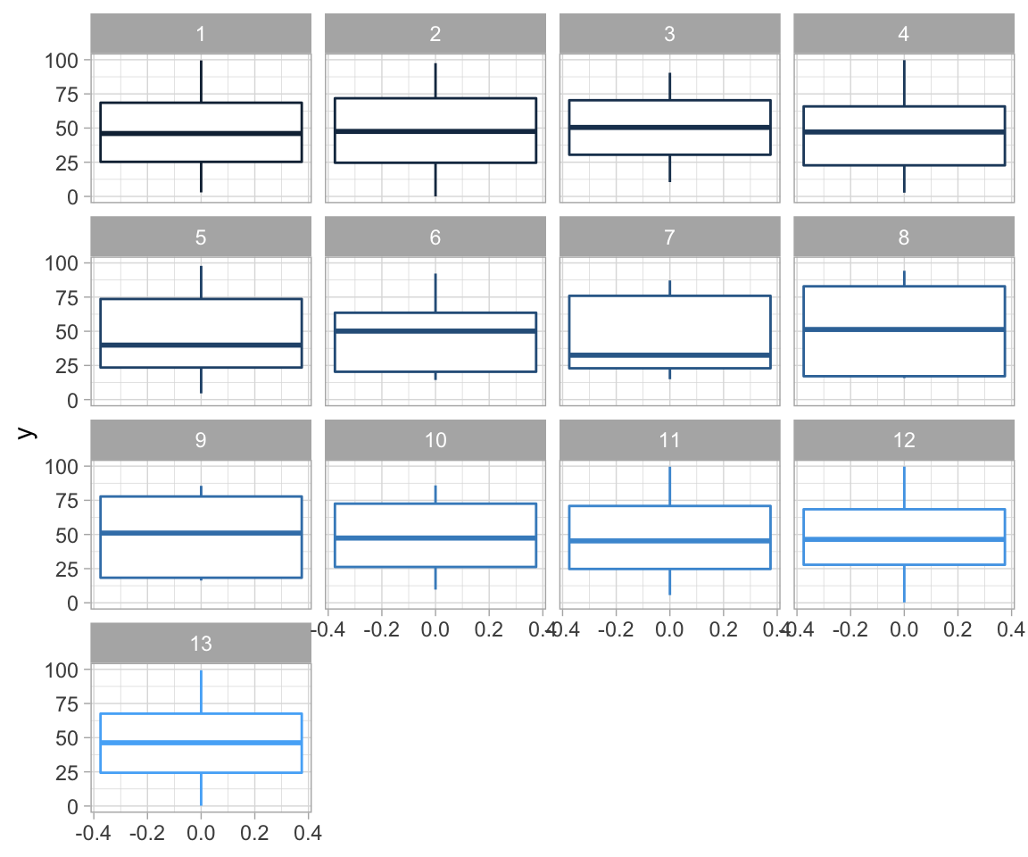
ggplot(data = df, aes(y = x, colour = ID)) +
    geom_boxplot() +
    theme_light() +
    theme(legend.position = "none") +
    facet_wrap(~ID, ncol = 4)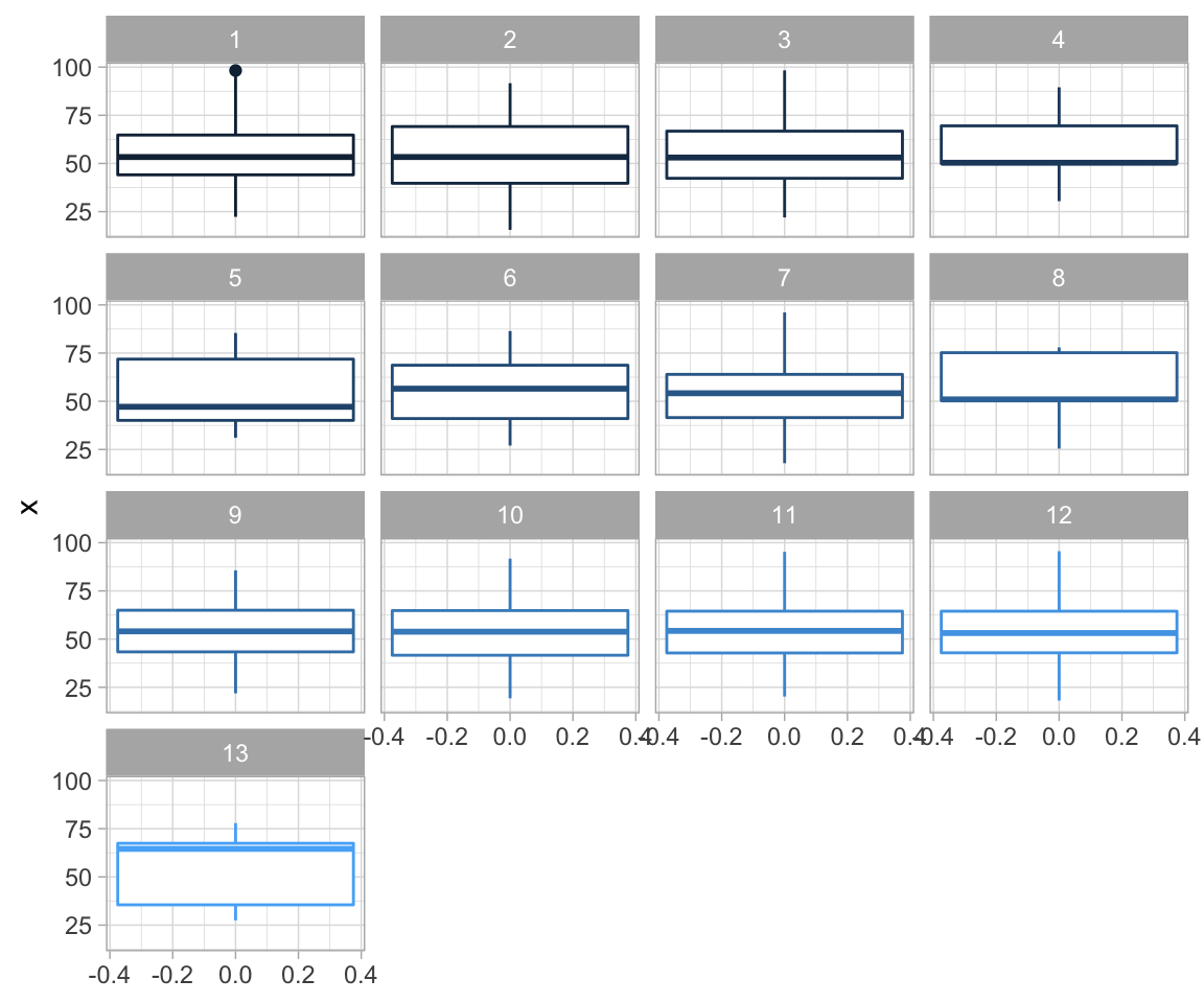
Most of them seem quite similar. Let’s see what our data actually looks like:
ggplot(datasaurus_dozen, aes(x = x, y = y, colour = dataset)) +
    geom_point() +
    theme_void() +
    theme(legend.position = "none") +
    facet_wrap(~dataset, ncol = 4)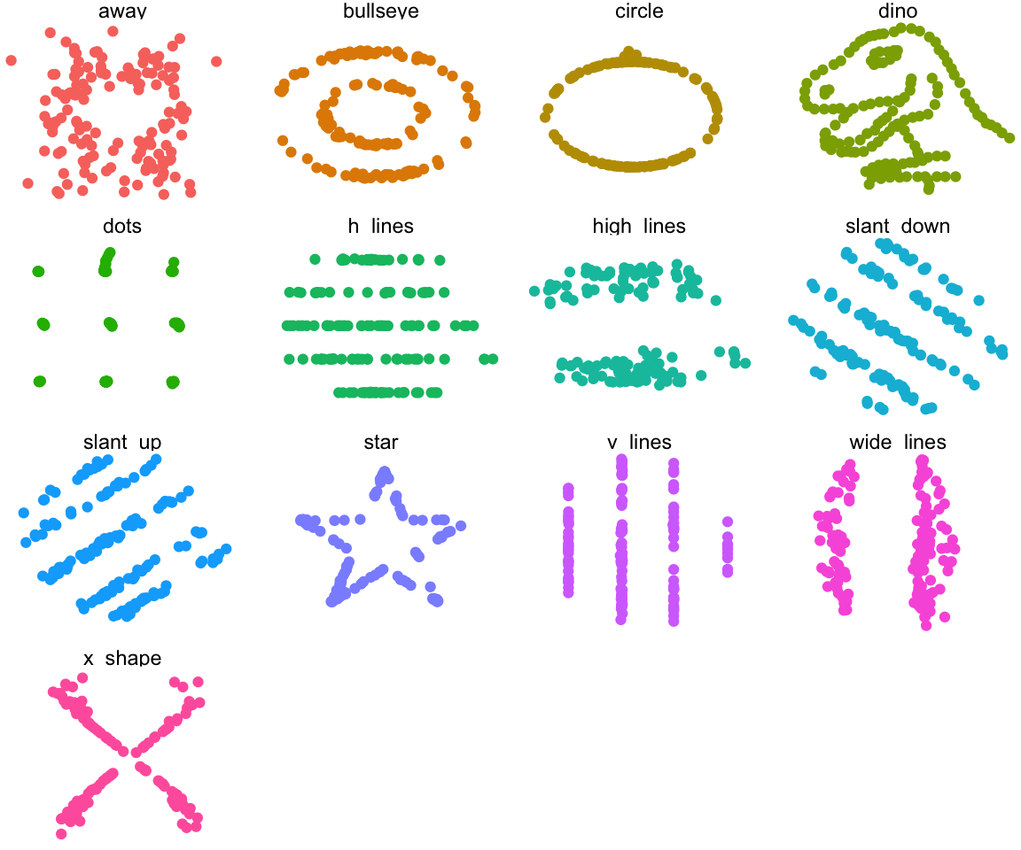
Tutorial 5
Agenda:
Vocab
Group Discussion
Group Presentations
Ticket Out the Door / Self Reflection
Vocab
Type I error
Type II error
What are two-sample and one-sample tests?
One sample test: I want to see if observations from a certain group are different from a known constant value. (one group -> one sample)
Two sample test: I want to see if observations from two different groups differ from eachother. (two groups -> two samples)
- Approximate Permutation test
Great resource (With LLAMAS!) here
- How to determine Type I and Type II errors?
You can’t! That is why we are so obsessed with the idea of p-values and power in statistics. When conducting a study you will almost never know that you end up with a Type I or Type II error. We are only able to control the error rate by focusing on studies with low p-values and high power.
- How to calculate p-values - review
We use simulations. All of the code you wrote that was about repetitions is just to get a p-value for the problem. In short:
You conducted a study and obtained some result.
Take the distribution under the null hypothesis (e.g. probability of some event is 50%)
Run a large number of simulations using that distribution
See in what % of simulations you saw result as extreme or more than your observed test statistic.
That is your approximate p-value. The more simulations you run, the closer it is to the actual p-value.
Real-world example: Somebody is being convicted of murder.
\(H_0\) ? \(H_a\) ? Type I error? Type II error?
Group Discussions:
Come up with one more example!
Summarize your results from Question 2 c: Do you have stronger evidence against the null hypothesis of no difference in median anxiety scores for the two groups, or more evidence against the null hypothesis of no difference in mean anxiety scores?
Look at the presentation rubric, which three aspects do you think are the most important for a successful presentation? (Write down a list of exactly 3)
Oral Presentations:
Scenarios
A health survey asked 200 individuals aged 20-45 living in Toronto to report the number minutes they exercised last week. Researchers were interested in determining whether the average duration of exercise differed between people who consume alcohol and those who do not consume alcohol. Assume the researchers who conducted this study found that people who drank alcohol exercised, on average, 20 minutes per week. In contrast, people who did not drink alcohol exercised 40 minutes per week, on average. The researchers reported a p-value of 0.249.
A study was conducted to examine whether the sex of a baby is related to whether or not the baby’s mother smoked while she was pregnant. The researchers used a birth registry of all children born in Ontario in 2018, which included approximately 130,000 births. The researchers found that 4% of mothers reported smoking during pregnancy and 52% of babies born to mothers who smoked were male. In contrast, 51% of babies born to mothers who did not smoke were male. The researchers reported a p-value of 0.50.
Based on results from a survey of graduates from the University of Toronto, we would like to compare the median salaries of graduates of statistics programs and graduates of computer science programs. 1,000 recent graduates who completed their Bachelor’s degree in the last five years were included in the study; 80% of the respondents were female and 20% were male. Among statistics graduates, the median reported income was $76,000. Among computer science graduates, the median reported income was $84,000. The researchers reported a p-value of 0.014.
A team of researchers were interested in understanding millennial’s views regarding housing affordability in Toronto. The team interviewed 850 millennials currently living in Toronto. 84% reported that they felt housing prices were unaffordable in the city. Suppose the researchers were interested in testing whether this proportion was different from a study published last year, which found that 92% of millennials reported that housing costs were unaffordable. The researchers reported a p-value of 0.023.
Suppose a drug company was interested in testing a new weight-loss drug. They enrolled 20,000 participants and assigned 10,000 to take their new drug, SlimX, and 10,000 to take a placebo. The researchers found that over 2 months, participants who took SlimX lost, on average, 5 lbs. In comparison, the control group lost 4.5 lbs during the same time. The researchers reported a p-value of \(<0.0001\).
Ticket out the door
Everyone grabs a piece of paper, HAVE TO WRITE A QUESTION about the course materials.
Tutorial 6
Agenda:
Ticket out the door answers
Reminders
Midterm
Vocab Review
Group Discussion
Poster Project
Written Evaluation
Ticket out the door answers
- Will the materials be more complicated and difficult than what we are learning now?
In STA130 - I don’t think so. Hypothesis testing is probably the most difficult part of this course.
- NO
Thank you
How can we prepare for the midterm? What questions are we expecting to see?
Can we skip one or two tutorials
Firstly, :( Secondly: No, sorry.
- Can you set up a hypothesis for a 2 sample test as a 1 sample test?
Not really. Two sample will always be comparing two observed things against eachother, one sample always compares one sample vs a constant.
- I have a lecture right before the class, can I be late?
Yes, email me ahead and we can arrange for a 5 minute grace period.
- Why do we use permutation for two sample test and simulation for one sample test ?
You can’t really do permutation for one sample (you only have one category so there is nothing to swap with). We do permutation for two sample because it is a bit simpler to do than simulation for two samples, but you can do simulation for two samples.
- What is the difference between permutation test and simulations
Simulations are generating new, artificial data under the null hypothesis and make assumptions about the distribution, permutations require two groups but don’t generate new data, just shuffle it around.
- How can we test a null hypothesis if we only choose one sided alternative ?
The only change you do in terms of code is your p-value calculation is gonna be one sided. You will not be looking for simulated test statistics “as extreme or more” in the magnitude sense but only one direction. So if you are testing an alternative of the form \(p > 0.5\) you will only look for test statistics of \(\hat{p}_{\text{simulated}} > \hat{p}_{\text{observed}}\) not \(|\hat{p}_{\text{simulated}}| > |\hat{p}_{\text{observed}}|\)
- Can we get more examples on the presentation questions?
I am not 100% sure what you mean. Would you like more good presentation examples?
- What permutation is ?
Permutation is a fancy word for “shuffling things around”
- Is stats major a good choice with computer science ?
Depends on what you want to do - for pure software development - I don’t think it’s gonna benefit you much. If you want to do Machine Learning or some other data related niche of CS then I think it is the best option.
- Is stats a good choice for math?
Again, probably depends on what you want to do - The math we use in stats is not very advanced conceptually compared to what you would see in a math specialist program at UofT. The style of proofs is also very different until you get to grad school.
- For PS5 Q2c what would happen if we reversed the null and alternative hypotheses?
Reversing hypotheses will result in your Null being “not equal” and the alternative being “equal”. Your simulations and test statistic computation would be very difficult to do, since evidence against “not equal” is very hard to define and simulate from.
- Will we be tested on how to write code on the midterm?
You will not be expected to write perfect quality code on the exam. You might be asked to fill in some blanks or write simple code but we don’t expect you to memorize the syntax of functions.
Reminders
Please submit your names along with your presentation outlines
There is no tutorial next week (Reading week yay!)
Midterm
Your midterm is on Friday after reading week during the tutorial time in EX100
You MUST go to our section midterm
No Calculators
See Quercus for practice tests (DO THEM!)
Go to Office hours (no OH during reading week)
Vocab
- Confidence Intervals:
The definition of Confidence intervals is subtle and not at all intuitive. The intuitive definition you probably have in mind is actually for something that is called a Credible Interval that comes from a different part of statistics.
Definition:
Purpose: Obtain an estimate the parameter that reflects sampling variability.
Check that they make sense - If you are looking at CI for probability make sure it is inside the \([0,1]\) interval.
- Bootstrap
The purpose of bootstrapping is to estimate the sampling distribution and extract some insight from it, for example confidence intervals for a parameter of choice.
There are many different versions of bootstrapping. We are using percentile bootstrapping which works best for large samples and when the underlying distribution is symmetric and continuous.
You will see other versions of bootstrapping in upper year statistics classes.
Group Discussions
Are the use of p-values and confidence intervals mutually exclusive? What do the two have in common? How do they differ? Think about under which circumstances you may want to use each of these.
If you and your partner both applied the same bootstrap sampling method to the same data, do you expect that you both arrive at the same estimate and CI? What are some factors that you would need to consider (and hold constant) to ensure that you both arrived at the same answer?
It’s Valentine’s Day! You are interested in whether there is a difference in the proportion of couples who tilt their heads to the right or left when they kiss! You survey several students on campus and find that 35.5% tilt their heads to the left when kissing; 95% CI: (27%, 44%). Which of the below (Question 1d) is the correct interpretation of the 95% CI?
We are 95% confident that between 27% and 44% of kissing couples in this sample tilt their head to the left when they kiss
There is a 95% chance that between 27% and 44% of all kissing couples in the population tilt their head to the left when they kiss.
We are 95% confident that between 27% and 44% of all kissing couples in the population tilt their head to the left when they kiss.
If we considered many random samples of 124 couples, and we calculated 95% confidence intervals for each sample, 95% of these confidence intervals will include the true proportion of kissing couples in the population who tilt their heads to the left when kissing.
Poster Project
Now it’s time for you guys to start planning what you will do in for your poster project. Things you should talk about:
- The research question(s) they are interested in investigating.
What is something that the Toronto Police might be interested in knowing?
Any interesting visualizations. Remember, these should be interesting and useful for the audience. They should also be appropriately labelled and should stand alone
Think about whether you will need to join datasets to answer your research question. You are able to use additional sources of data, if they like – and if relevant to their research question. (This would be considered in the WOW factor category!)
What will each group member be responsible for?
How often will you meet?
NOTE: You are not committed to this plan and it can change as you learn new methods. This activity is to get you thinking about the project early on. If you wait until after reading week you will be very rushed to complete the project and it will likely end up not being very good.
Aspects to consider in your research plan:
The research question(s)
The hypotheses
Aims/objectives
Research design: data, methods, visualizations, etc.
Written Evaluation
Write out your research plan!
I suggest you consider formatting it to include the above sections (i.e., Research question; Hypothesis; Objective; Research design: data/ variables, methods, visualization, etc.)
Tutorial 7
Agenda:
Vocab List (~ 20 mins)
Group Discussions (~ 20 mins)
Organizational Stuff (~ 5 mins)
Group work (~ 30 mins)
Presentations (~ 30 mins)
Vocab:
Confusion Matrices - TP, FP, TN, FN
TP - True positive = Predicted to be A and is A
FP - False positive = Predicted to be A but is B
TN - True Negative = Predicted to be B and is B
FN - False Negative = Predicted to be B but is A
Overall there are two parts:
(True / False) = Was the prediction correct?
(Positive / Negative) = What was the prediction?
There are a lot of derivative terms coming from the 4 entries to the confusion matrix. The main ones are :
- TPR - True Positive Rate, in other words what proportion of all positives are the true positives. This is also called Sensitivity and Recall. (Yes, you should know all 3 names)
\[ TPR = \frac{TP}{TP + FN} = \frac{TP}{P} = \frac{TP}{\text{Actually Positive}} \]
FPR - False Positive Rate, same as above except False positives.
TNR - True Negative Rate, i.e. what proportion of all predicted as negative are actually negative. This is also called Specificity. (Yes, you should know both names)
Accuracy - What proportion of things was predicted correctly
PPV - positive predictive value. It’s the number of true positives divided by the number of predicted positives. This is usually called Precision.
\[ PPV = \frac{TP}{TP + FP} = \frac{TP}{\text{Predicted Positive}} \]
The wikipedia article on the confusion matrix is quite good at explaining this and how to compute it.
Prediction
Classification - One of broadly speaking two types of main tasks in prediction we try to assign a group belonging to each datapoint / object.
ROC - Receiver Operating Characteristic curve is the curve that shows a tradeoff for your model between Sensitivity (TPR) and Specificity (TNR). Because we usually give the class prediction in terms of “probability” we can design a cut off at different thresholds. I.e. we only predict positive if the model is 50% or more confident it is positive (and 100% - 50% = 50% or less confident it is negative). As we vary that threshold the TPR and TNR will change resulting in a curve.
Train/Test/Validation Split
Group Discussions
Warmup question to everyone:
- Can you think of any real-life examples where you may want to develop a classification tree?
In Groups:
Question 1:
Suppose you developed a classification tree to diagnosis whether or not somebody has Disease X, which is a very serious and life-threatening illness if left untreated. The overall accuracy of your tree was 77%; false-positive rate was 32%; and false-negative rate: 7.9%. Suppose that your colleague also created a classifier for the same purpose. Its overall accuracy is 81%; false-positive rate is 6.4%; and false-negative rate is 39%. Explain which of these two classifiers you would prefer to use to diagnosis Disease X.
Question 2:
Suppose you developed a classification tree only to later discover that the values for one of your covariates is missing for a number of observations. Can you use the classification tree you built to make a prediction for these individuals? Explain.
Question 3:
Imagine you were interested in making a classifier to predict what movie somebody would be most interested in. To do this, you first gathered data from a sample of your closest friends. You validated and tested your classifier using different subsets of this data. Now you wish you use your classifier to predict which movie Dr. Moon/ White, your TA, your parents, etc. would like. How well do you think your classifier will perform in each of these cases?
Presentations:
Things to keep inmind:
Content:
What is the main message you want to get across?
Create an (organized) outline of your presentation
Define terms early
Make clear transitions between parts of your presentation
Make your data/ figures meaningful
Summarize
Delivery:
Be confident, make eye contact and avoid reading
Avoid filler words – “ummm”, “like”, “you know”
Speak slowly and it’s ok to pause (and breathe!)
Remember to enunciate all the parts of each word
Practice! Practice! Practice!
Presentation Topics:
Topic 1:
Explain how to make a ROC curve and the type of information it provides.
Based on the ROC curves you created for Practice Problem 4c, describe the accuracy of each of the two trees.
Does this fit your expectations based on the description of each classifier?
Which ROC curve would you prefer to classify your spam mail?
Topic 2:
Explain what a confusion matrix is and how each cell is calculated.
Using the confusion matrix you calculated in question 1d to answer the followingquestions: What percentage of countries with “good life expectancy” that were classifiedas having such actually had “good” life expectancy according to the majority rules cutpoint (i.e., 50%) based on each of the two classifiers?
What are other terms used to describe the percentages you calculated above?
How do the two classifiers compare? Does this fit your expectations based on the description of each classifier?
Topic 3:
Summarize the classification tree from Practice Problem 1b. Make sure to include at least the following points: how the splits on each variable were selected, how a new observation would be predicted by this classification tree.
In part c, you considered more factors. Do you think there may be other important factors to consider? Explain how including these might impact the accuracy of your tree.
Organization
I will walk around and get your poster groups into a table.
Tutorial 8
Vocab (30 mins)
Group Presentations (60 mins)
Project Work (remaining time)
Vocab
- Correlation Coefficient
\[ \rho(X,Y) = \frac{Cov(X,Y)}{\sqrt{Var(X)} \sqrt{Var(Y)}} = \frac{\Sigma\left((X-\mu_X)(Y-\mu_{Y}) \right)}{\sqrt{\Sigma(X-\mu_{X})^2}\sqrt{\Sigma(Y-\mu_{Y})^2}} \]
- Standard regression Equation
\[ Y_i = \beta_0 + \beta_1 X_{1,i} + e_i \]
or in matrix form (I’m pretty sure you don’t need to know this one until 302):
\[ Y = X\beta + e \]
Measures of fit
Assumptions of LR
Classification vs Regression
Group Activities
Topic 1:
Based on questions 1a-b
Describe your plot produced in question 1a. Make sure to note the x- and y-axis and to describe the association you observe, if any. E.g. the association linear, positive, negative, strong, weak, etc.?
Does there seem to be an association between log number of transistors and year for GPUs? For CPUs? Does this make sense based on your prior expectations?
Do there appear to be many outliers? Why might this matter?
Topic 2:
Why did you plot the log number of transistors instead of the unmodified count?
Is the association between log transistor count and year stronger for CPUs or GPUs? Explain. Does this make sense based on your prior expectations?
Topic 3:
Based on questions 1g-i
Provide a simple linear regression equation for the association between log transition count and year – separately for CPUs and GPUs. Explain what each part of the model means in lay terms.
What is the model equation and estimated values? What is the coefficient of determination? Explain what these values mean and an interpretation in lay terms.
Topic 4:
Based on question 1j-k
Briefly explain why or why not the interpretation of the intercept is helpful for understanding Moore’s Law.
How well does your model perform as a predictive model?
Are there any other variables you think may be important factors influencing this association?
Topic 5:
Under what conditions would you use correlation and/or regression analysis?
Include comments on the type of data needed and a suggestion for their use.
You can refer to this week’s practice problems for examples.
Presentations
Ticket Out The Door
We did this before - write down any question you have about the course on a piece of paper, don’t sign it. Hand it to me before you leave.