STA220 Additional Materials
Michal Malyska
library(gridExtra)
#library(summarytools) ### There is a problem with summarytools on the current R version
library(tidyverse)
library(forcats)
library(GGally)


set.seed(1337) # This line makes the random generation for this file be the same
# Every time it is run
Introduction
Since one of my goals is to teach this course next year, in my free time I will be writing up some materials that would serve as a guide. It is by no means necessary to ready any of the things on here to succeed in the course, however I hope tips and readings I post here could help speed up your work and provide additional understanding of the material, beyond what you learn in the classroom right now.
Resources:
R and RStudio Setup
If you need help setting up R and Rstudio, I host a guide on my resources page
Loading Data
You can find a fully commented guide on how to load in tabular data using the faster, tidyverse function read_csv() here
Analyzing Data
Visualization
The why
Let’s begin with a short exercise - I have loaded 12 new datasets into my memory. They are all simple and contain 142 observations each of 2 variables - x and y. I will begin by just looking at some data summaries that we typically look at in this class. Mean, standard deviation, and correlation of the two variables.
library(datasauRus)
datasaurus_dozen %>%
    group_by(dataset) %>%
    summarize(
        mean_x    = mean(x),
        mean_y    = mean(y),
        std_dev_x = sd(x),
        std_dev_y = sd(y),
        corr_x_y  = cor(x, y)
    ) %>%
    mutate(ID = 1:13) %>%
    dplyr::select(-dataset)
## group_by: one grouping variable (dataset)## summarize: now 13 rows and 6 columns, ungrouped## mutate: new variable 'ID' with 13 unique values and 0% NA## # A tibble: 13 x 6
## mean_x mean_y std_dev_x std_dev_y corr_x_y ID
## <dbl> <dbl> <dbl> <dbl> <dbl> <int>
## 1 54.3 47.8 16.8 26.9 -0.0641 1
## 2 54.3 47.8 16.8 26.9 -0.0686 2
## 3 54.3 47.8 16.8 26.9 -0.0683 3
## 4 54.3 47.8 16.8 26.9 -0.0645 4
## 5 54.3 47.8 16.8 26.9 -0.0603 5
## 6 54.3 47.8 16.8 26.9 -0.0617 6
## 7 54.3 47.8 16.8 26.9 -0.0685 7
## 8 54.3 47.8 16.8 26.9 -0.0690 8
## 9 54.3 47.8 16.8 26.9 -0.0686 9
## 10 54.3 47.8 16.8 26.9 -0.0630 10
## 11 54.3 47.8 16.8 26.9 -0.0694 11
## 12 54.3 47.8 16.8 26.9 -0.0666 12
## 13 54.3 47.8 16.8 26.9 -0.0656 13As we can see, the numerical summaries are all pretty much the same - so we would expect that whether we are fitting straight lines through the dataset (Linear Regression), or doing simple hypothesis testng, the results should be fairly similar. Let’s confirm that.
Tidyverse allows us to do some beautiful tricks, like nesting the linear models in the tibble we are working with. If you want to know a bit more on how this is done take a look at the R for Data Science book online, chapter 25 : “Many Models”.
# Create nested datasets
by_dataset <- datasaurus_dozen %>%
    group_by(dataset) %>%
    nest()
## group_by: one grouping variable (dataset)# Write the simple linear regression function we care about.
slr <- function(df) {
lm(y ~ x, data = df)
}
# Use the function on all the nested datasets using the map function.
by_dataset <- by_dataset %>%
mutate(model = map(data, slr))## mutate (grouped): new variable 'model' with 13 unique values and 0% NA# Let's look at model coefficients (This is the intercept of the line and the slope)
# y = Intercept + Slope * x
for (model in by_dataset$model) {
print(model$coefficients)
}## (Intercept) x
## 53.4529784 -0.1035825
## (Intercept) x
## 53.4251300 -0.1030184
## (Intercept) x
## 53.21108724 -0.09916499
## (Intercept) x
## 53.8908434 -0.1115508
## (Intercept) x
## 53.5542263 -0.1053169
## (Intercept) x
## 53.326679 -0.101113
## (Intercept) x
## 53.8087932 -0.1100695
## (Intercept) x
## 53.0983419 -0.0969127
## (Intercept) x
## 53.7970450 -0.1098143
## (Intercept) x
## 53.8094708 -0.1101675
## (Intercept) x
## 53.8125956 -0.1102184
## (Intercept) x
## 53.8497077 -0.1108172
## (Intercept) x
## 53.6349489 -0.1069408We can see that we fit pretty much the same line (y = 53.8 - 0.1x) for all the sets of data. Now let’s see what the datasets look like, with the fitted lines.
ggplot(datasaurus_dozen, aes(x = x, y = y, colour = dataset)) +
    geom_point() +
    theme_void() +
    theme(legend.position = "none") +
    facet_wrap( ~ dataset, ncol = 4) +
    geom_abline(slope = -0.1, intercept = 53.8, colour = "red", size = 1)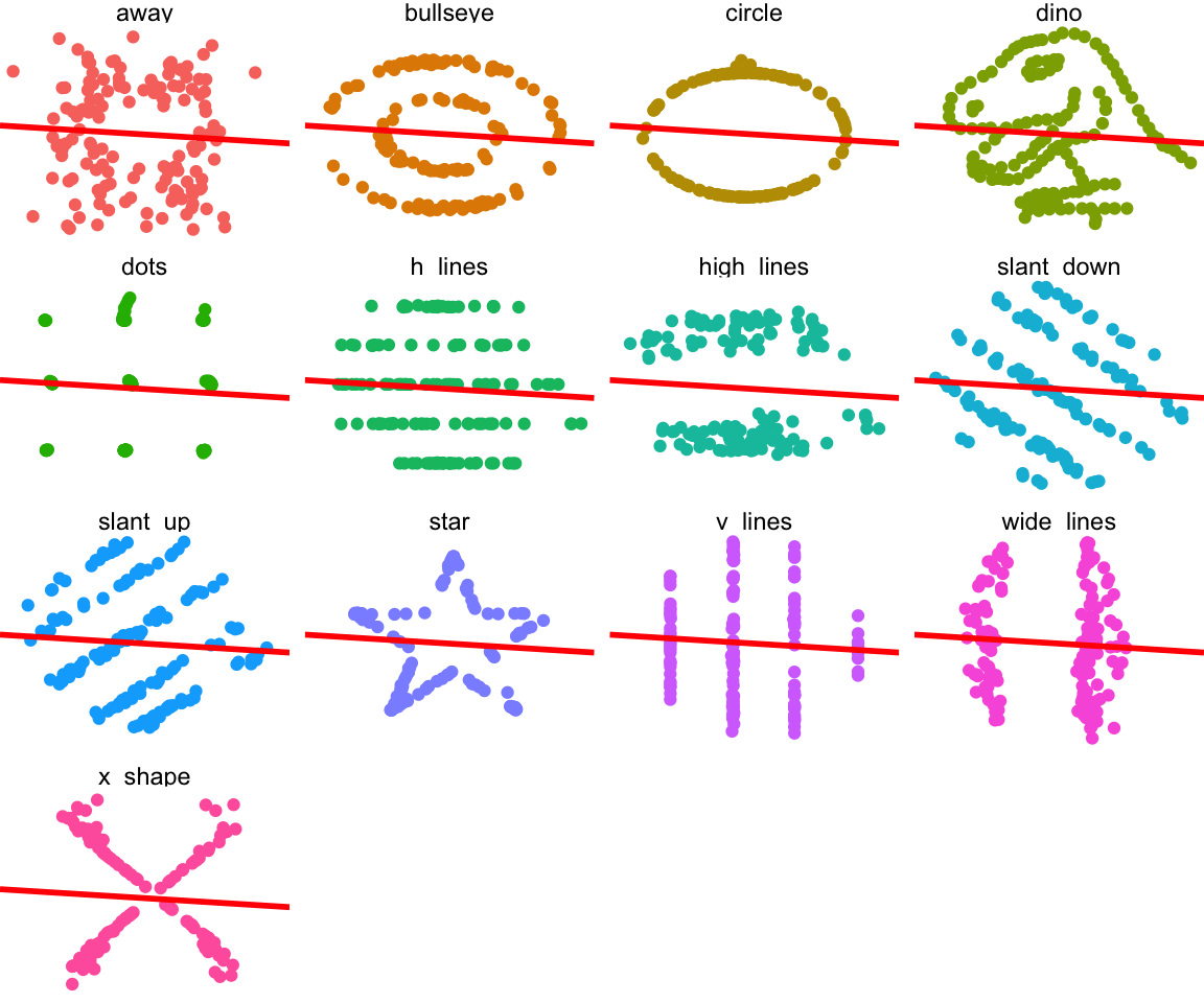
Clearly none of these datasets should have a linear model fit to them. And this is why you should always start with looking at your data before doing any analysis.
Assessing Normality
Most people starting their journey in statistics
struggle with something that used to be problematic for me as well - assessing normality from Normal QQ-plots. Understandably, It’s very difficult to quantify how much does a plot look like a “normal” Normal QQ-plot would, especially at smaller sample sizes. I want to show you two approaches that have helped me, and that I usually resort to, when looking for normality.
Shapiro Wilk test
Description and Example
Shapiro Wilk test is conceptually somewhat similar to what you’ve seen so far for assesing the equality of variances - the F test. The null hypothesis is that the data comes from a normal distribution, and looks to see if the the data gives evidence against that assumption. The test statistic is beyond the scope of this course, and is an example of something you will learn if you take STA355. If you’re interested you can just look at the wikipedia page. One very good property of the Shapiro-Wilk test is that it been shown that it has the best power for a given significance - meaning it is most likely to reject the null given that the data is not normal for a given significance level.
There are no new packages for you to install to be able to run a Shapiro-Wilk test in R, the function is built in with the name shapiro.test(). You can find an example code, where I assess the normality of 5 different generated datasets.
# First, I'm gonna generate a few sample datasets for our tests:
ex1 <- rnorm(5000)
ex2 <- rt(100, 3)
ex3 <- sample(c(1,-1),size = 1000 ,replace = TRUE)*(rexp(1000, rate = 5) - 5)
ex4 <- rcauchy(250)
ex5 <- rnorm(15)
ex6 <- rt(50, 1)

# Then I will perform shapiro wilk tests on all of them and see how well it performs:

test1 <- shapiro.test(ex1)
test2 <- shapiro.test(ex2)
test3 <- shapiro.test(ex3)
test4 <- shapiro.test(ex4)
test5 <- shapiro.test(ex5)
test6 <- shapiro.test(ex6)

# Let's see the p-values for each of the tests:

p_vals <- tibble(normal = as_factor(c("Yes", "No", "No", "No" ,"Yes", "No")),
                 p_val = c(test1$p.value, test2$p.value,
                          test3$p.value, test4$p.value,
                          test5$p.value, test6$p.value))

ggplot(data = p_vals) +
    aes(x = normal) +
    aes(y = p_val) +
    aes(col = fct_inorder(normal)) +
    scale_color_manual(name = "", values = c("green", "red")) +
    geom_jitter(width = 0.1, height = 0, size = 4) +
    labs(title = "P-values of Shapiro-Wilk test for the example datasets",
         x = "Normal?",
         y = "P-value") +
    geom_hline(yintercept = 0.05, lty = 2, col = "red") +
    theme_bw(base_size = 12) +
    scale_y_continuous(limits = c(0,1))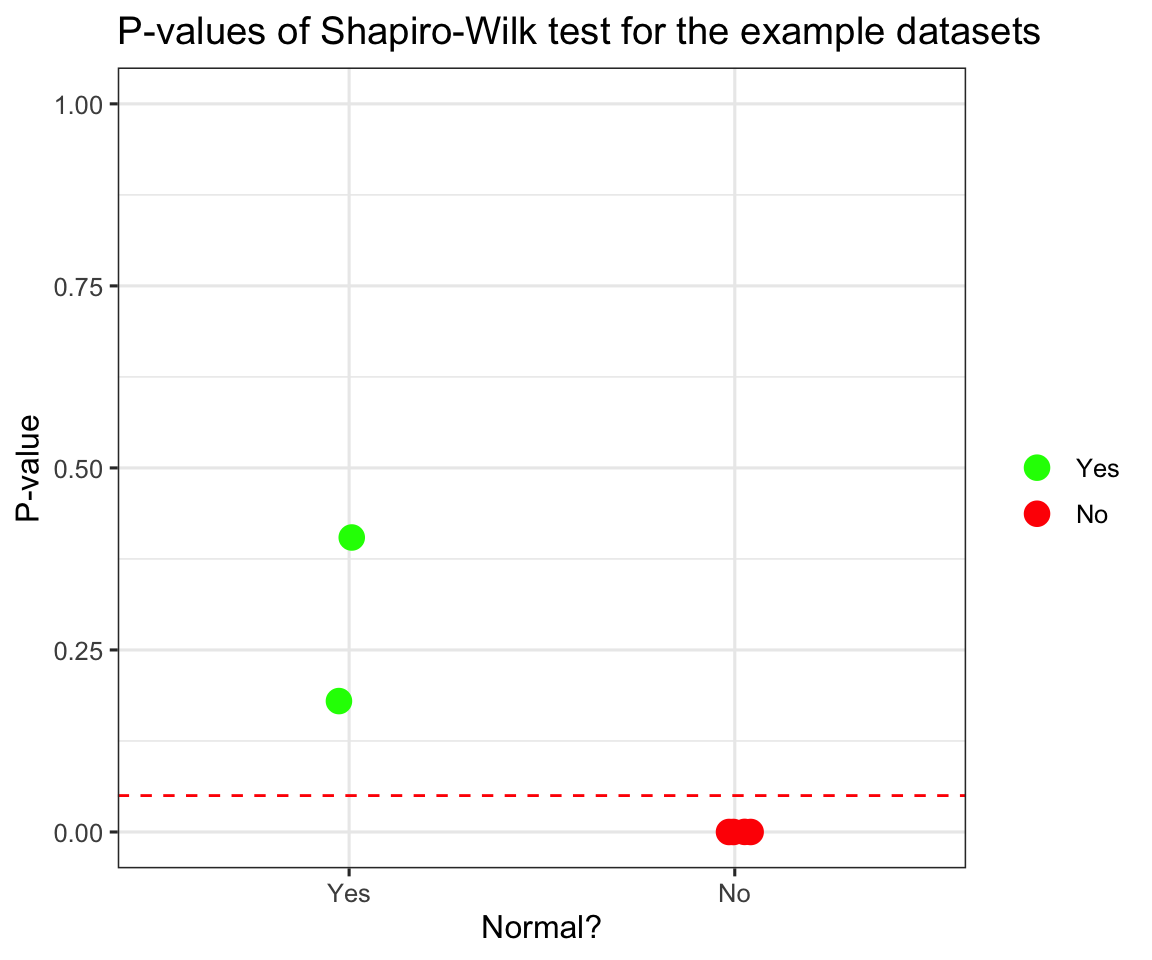
We can see that it peforms quite well, in fact all the p-values for non-normal distributions are so close to 0, I had to add sideways jitter for you to be able to tell them apart.
Simulations
Now I will try to see it’s behaviour under the null hypothesis, by simulating normals and looking at the distribution of p-values.
new_pvals <- NULL

for (i in 1:1000) {
    ex7 <- rnorm(100)
    test7 <- shapiro.test(ex7)
    new_pvals <- c(new_pvals, test7$p.value)
}

new_pvals <- tibble(ID = 1:1000,
                    p_values = new_pvals,
                    reject = if_else(p_values < 0.05, TRUE, FALSE))

ggplot(data = new_pvals) +
    aes(y = p_values) +
    aes(x = ID) +
    aes(col = reject) +
    geom_point(size = 1) +
    scale_color_manual(name = "", values = c("green", "red"),
                       labels = c("Don't reject", "Reject")) +
    labs(title = "P-values of Shapiro-Wilk test for normal simulation",
         x = "ID",
         y = "P-value") +
    geom_hline(yintercept = 0.05, lty = 2, col = "red") +
    theme_bw(base_size = 12) +
    scale_y_continuous(limits = c(0,1))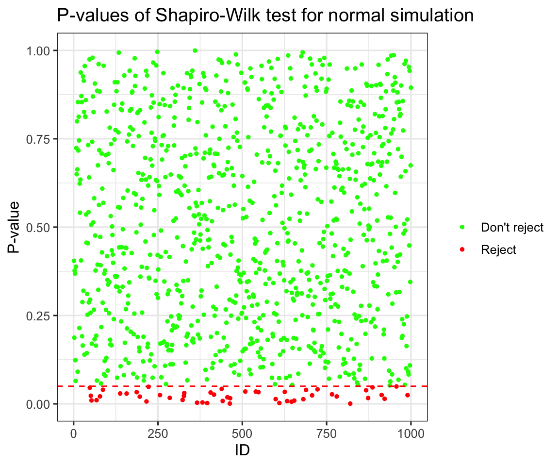
prop_reject <- mean(new_pvals$reject)Now this plot doesn’t tell us too many new things, but you can clearly see the uniform distribution of p-values under the null hypothesis (again if you want to learn more you can take STA355), and we can see that at the \(\alpha = 0.05\) we rejected 0.05 of the simulations, which is exactly what we would expect. Now how about seeing how it performs distinguishing t-distributions with higher and higher degrees of freedom from normals. Again I will run the simulation:
# I will run a simulation of 1000 tests each from t distributions with varying degrees
# of freedom.

dfs <- c(1, 2, 3, 4, 5, 10, 20, 50, 100, 1000)

new_pvals <- NULL
dfs_ind <- NULL

for (df in dfs) {
    for (i in 1:1000) {
        ex8 <- rt(100, df = df)
        test8 <- shapiro.test(ex8)
        dfs_ind <- c(dfs_ind, df)
        new_pvals <- c(new_pvals, test8$p.value)
    }
}

new_pvals <- tibble(ID = 1:length(dfs_ind),
                    degrees = as.character(dfs_ind),
                    p_values = new_pvals,
                    reject = if_else(p_values < 0.05, "Reject", "Don't reject"))

ggplot(data = new_pvals) +
    aes(y = p_values) +
    aes(x = as.factor(dfs_ind)) +
    aes(col = reject) +
    geom_jitter(width = 0.1, height = 0, size = 1) +
    scale_color_manual(name = "", values = c("red", "green"),
                       labels = c("Don't reject", "Reject")) +
    labs(title = "P-values of Shapiro-Wilk test for t simulation",
         x = "Degrees of Freedom",
         y = "P-value") +
    geom_hline(yintercept = 0.05, lty = 2, col = "red") +
    theme_bw(base_size = 12) +
    scale_y_continuous(limits = c(0,1))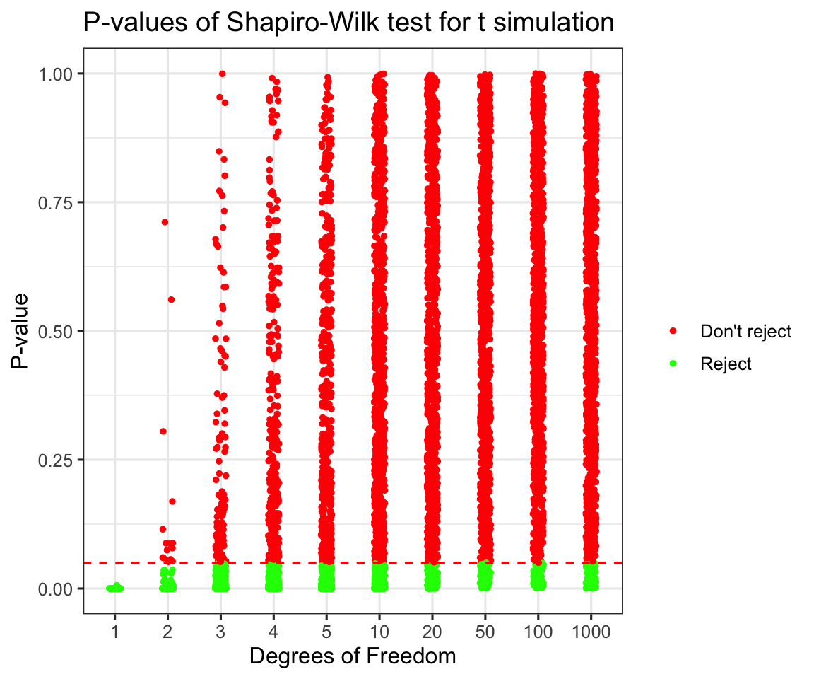
p_vals_summary <- new_pvals %>% group_by(degrees) %>%
    summarize(reject_prob = mean(p_values < 0.05)) %>%
    mutate(degrees = as.integer(degrees)) %>%
    arrange(degrees)
## group_by: one grouping variable (degrees)## summarize: now 10 rows and 2 columns, ungrouped## mutate: converted 'degrees' from character to integer (0 new NA)print(p_vals_summary)## # A tibble: 10 x 2
## degrees reject_prob
## <int> <dbl>
## 1 1 1
## 2 2 0.984
## 3 3 0.89
## 4 4 0.694
## 5 5 0.544
## 6 10 0.212
## 7 20 0.101
## 8 50 0.062
## 9 100 0.067
## 10 1000 0.066As we can see beyond 50 degrees of freedom we are not able to distinguish a t distribution from a normal even with a large sample (1000). Try thinking what would happen if we only had 100 or fewer datapoints. What is interesting to see is that even for 2 degrees of freedom there are some samples that didn’t provide enough evidence to reject the normality assumption.
Discussion and Limitations
Shapiro-Wilk has a very nice property of giving us something tangible to talk about when assessing normality of our data. However it has one limitation that is worth keeping in mind - it only works on sample sizes up to 5000 points. Of course there are ways to get around that problem (Try thinking about how you would do this!)
My Approach:
Normal Q-Q Plots
Unnecessary introduction
As you can probably tell I am overly excited that I now know how to make buttons in Rmarkdown that will go on my website.
Interpreting Q-Q Plots
The general idea behind interpreting Normal Q-Q plots is that we transform our data in a very specific way. Again, if you want to know a bit more, take STA355. For the purpose of this course all you need to know is that you will expect the newly transformed data to lie on a straight line y = x. However, because the world is not ideal, we will always have data that doesn’t lie on that straight line exactly, that would be too easy. This doesn’t necessarily mean that we have outliers. I’m actually quite convinced that the probability of all points being exactly on that line is exactly 0 for a given sample larger than a few points.
My solution
So let’s say I am looking at a nice small set of 100 observations. How do I assess the normality in practice ? Back when I was taking my first steps in R and data analysis, as you are now, I struggled with this immensly and always resorted to Shapiro-Wilk to avoid the problem. Then sometime last year I stumbled upon an article that proposed a solution so simple yet so brilliant I am still quite angry for not coming up with it on my own.
# Let's say I have some data, distribution of which I don't know.
my_data <- rnorm(100) # Let's pretend this never happened

prepare_grid <- function(my_data, multiplier = 8){

# Simulate 3, 8, 15 or some other (perfect square - 1) number of standard normals
# with the same sample size

l <- length(my_data)

my_normals <- rnorm(n = multiplier * l)
combined_data <- tibble(ID = c(rep(1, l), # ID for my data
                               rep(2:(multiplier + 1), l)), # ID's for the normals
                        points = c(scale(my_data), my_normals)) %>%
    arrange(ID) %>%
    mutate(ID = as.factor(as.character(ID)),
           ID2 = fct_anon(ID)) # Randomly shuffled ID's


plot <- ggplot(data = combined_data) +
    aes(sample = points) +
    theme_bw() +
    geom_qq() +
    geom_qq_line() +
    facet_wrap(.~ID2) +
    labs(title = "Randomly Arranged Q-Q Plots")

real_id <- as.integer(combined_data[1,3])
return(list(plot = plot, real_id = real_id))
}

prepare_grid(my_data)
## mutate: converted 'ID' from double to factor (0 new NA)## new variable 'ID2' with 9 unique values and 0% NA## $plot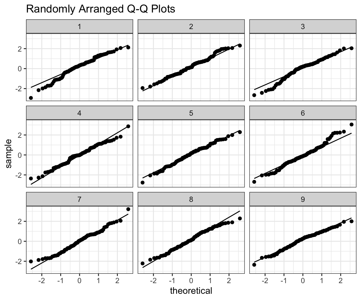
##
## $real_id
## [1] 3
As the title suggests I randomly arrange our data in a grid with 8 random normals. The trick is - if I can tell which one is my data from the plot, then it’s probably not normal. Feel free to use this function as you please, all I ask from you is that you give me credit for writing it, when using it.
Now let’s use old simulated data that is not normal and see if you are able to tell where it is in the grid. (Feel free to play around on your own)
prepare_grid(ex2)## mutate: converted 'ID' from double to factor (0 new NA)## new variable 'ID2' with 9 unique values and 0% NA## $plot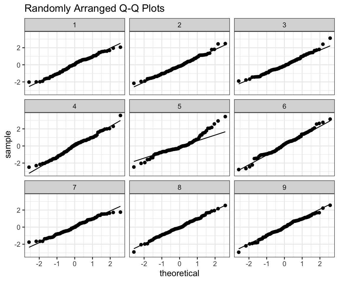
##
## $real_id
## [1] 5prepare_grid(ex3)## mutate: converted 'ID' from double to factor (0 new NA)
## new variable 'ID2' with 9 unique values and 0% NA## $plot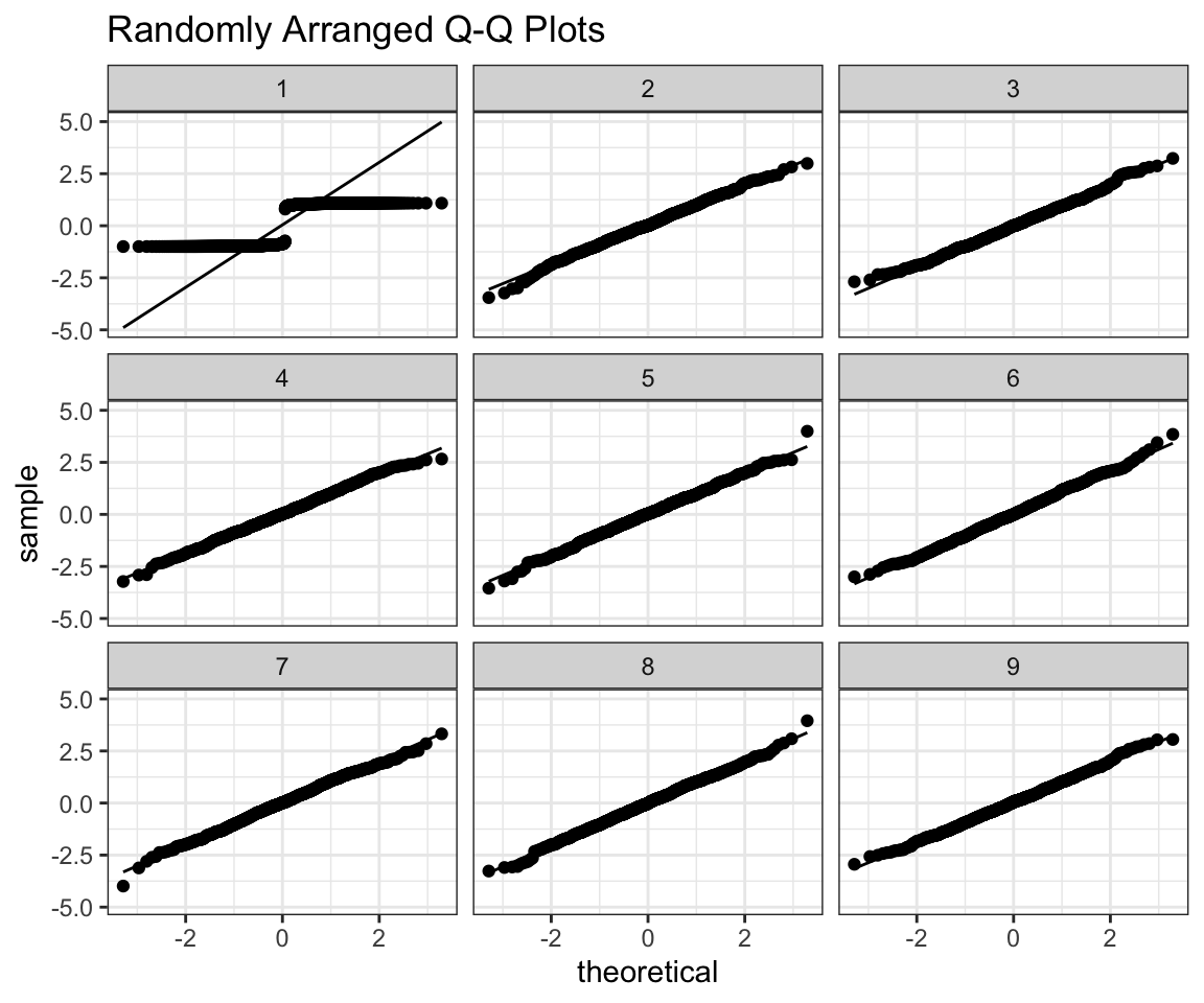
##
## $real_id
## [1] 1prepare_grid(ex4)## mutate: converted 'ID' from double to factor (0 new NA)
## new variable 'ID2' with 9 unique values and 0% NA## $plot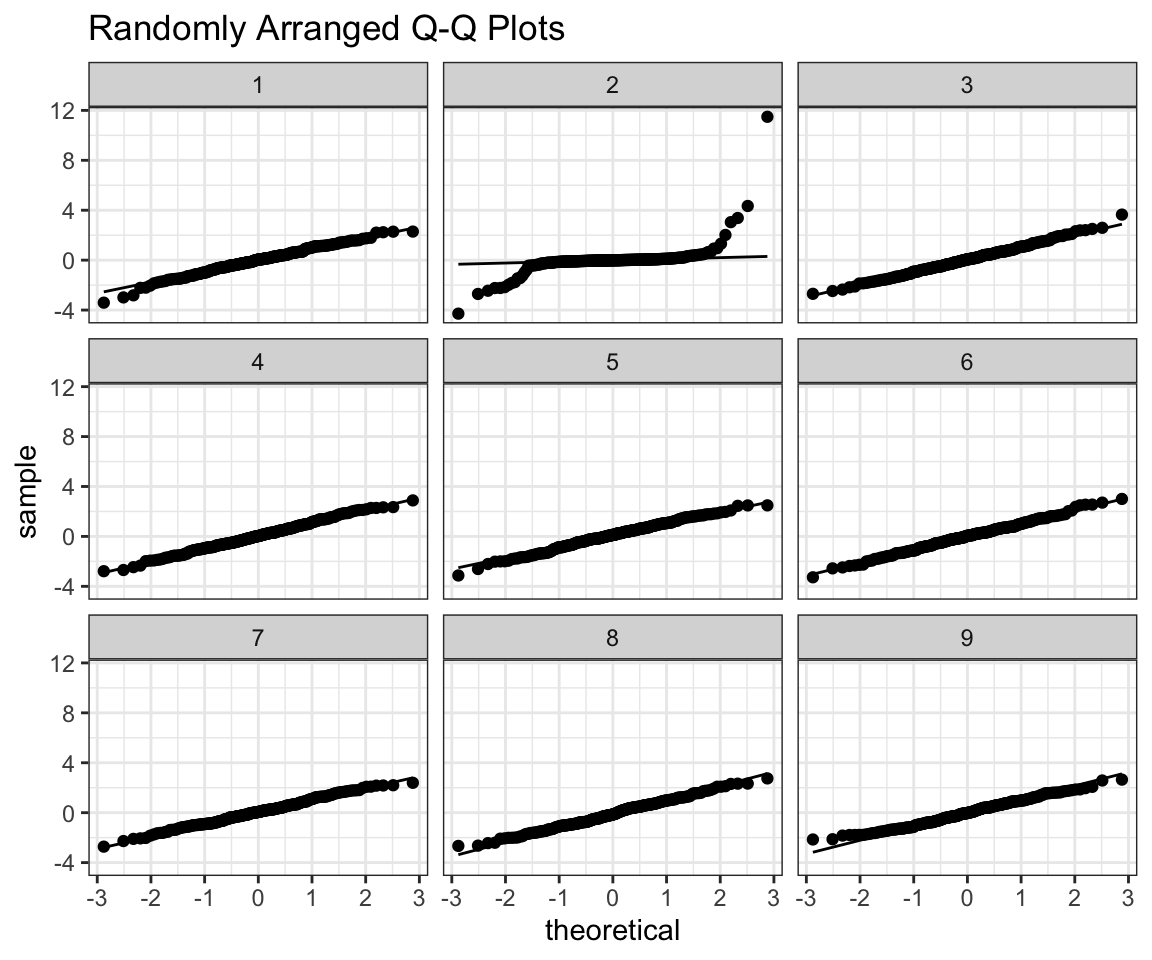
##
## $real_id
## [1] 2prepare_grid(ex6)## mutate: converted 'ID' from double to factor (0 new NA)
## new variable 'ID2' with 9 unique values and 0% NA## $plot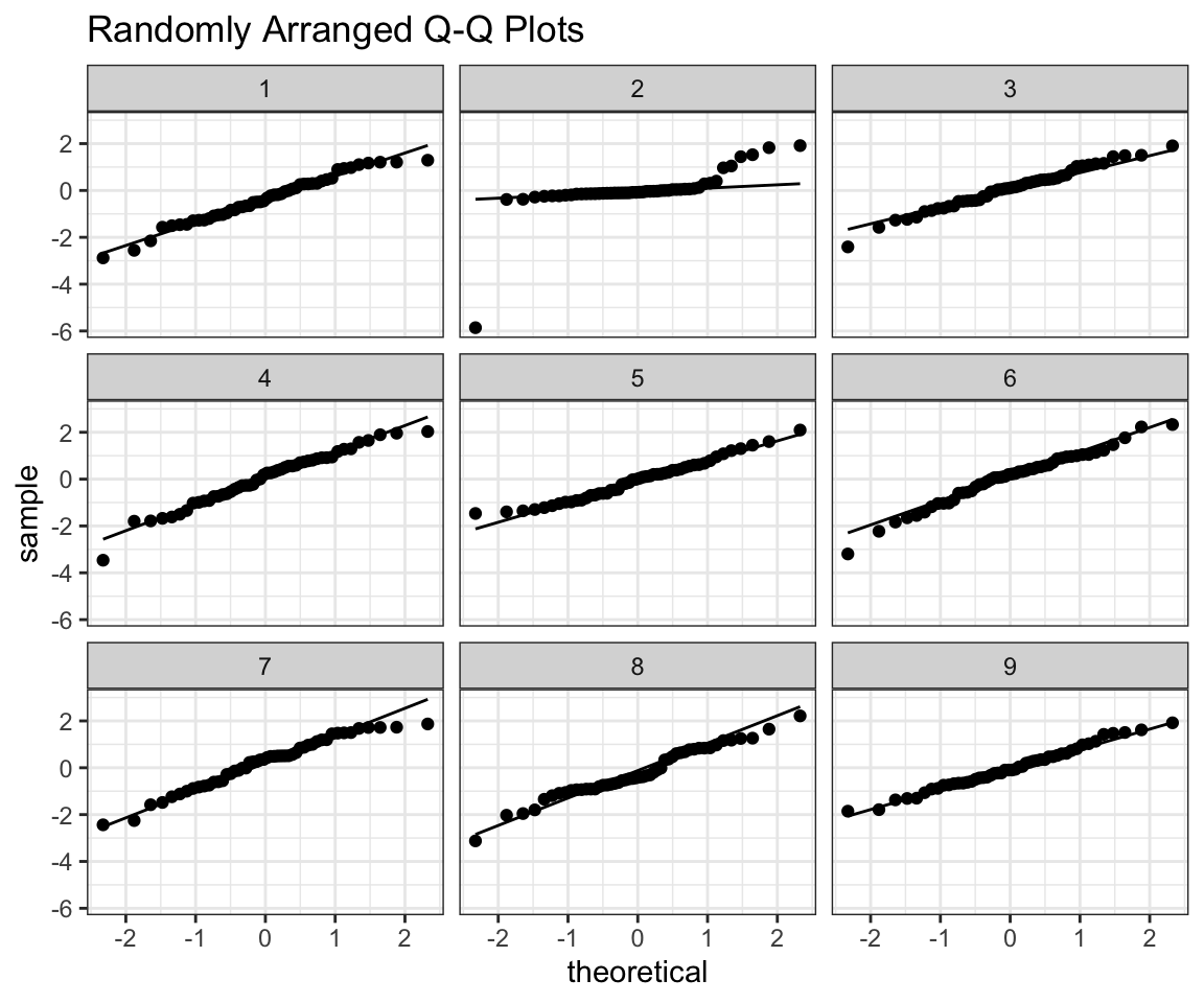
##
## $real_id
## [1] 2
In this class however, you should also be able to interpret QQ plots on their own. I will provide some intuition that I now use whenever looking at them, that I already showed in my tutorials.
All you need to know about how to view QQplots is that they try to measure how does your sample compare to a normal distribution with the same mean and standard deviation. In the ideal scenario points would fall exactly on the line. X axis is what you expect from a normal distribution, and Y axis is what you have actually observed. The middle part will usually fit very close to the line so you should focus on the right and left portions of the graph (tails). If the middle points are far away from the line you have a much bigger problem. The way to think about it is - Right side of the graph (higher theoretical quantiles) are the datapoints that have high values.
Let’s see an example.
# ggplot qqplot
rs <- ggplot(data = distributions) +
    aes(sample = right_skewed) +
    theme_minimal() +
    geom_qq() +
    geom_qq_line() +
    coord_fixed() +
    labs(title = "Right Skewed Distribution")
rs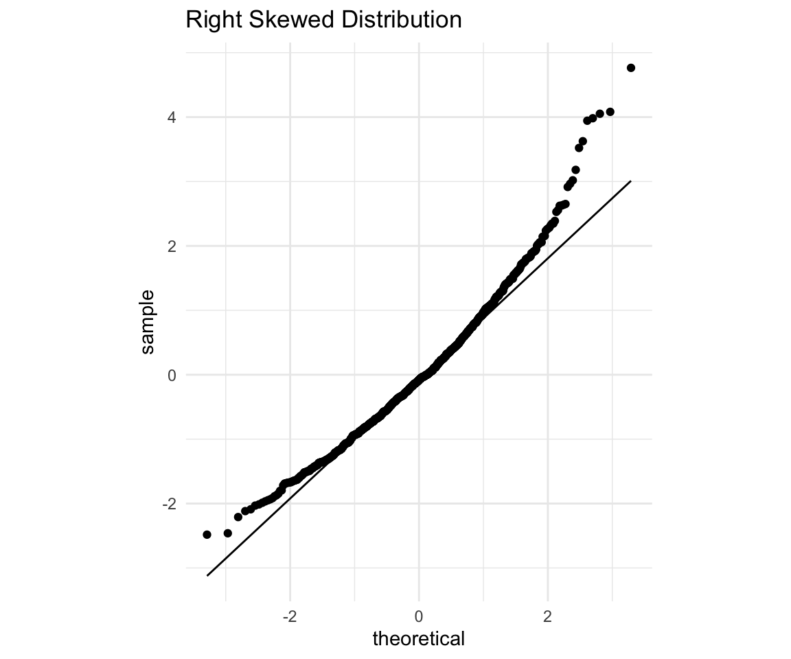
You should immediately notice that the points both on the right and on the left fall above the line. The way to interpret it is:
Since points on the right side (high on the X axis - those that are expected to be high in value) are higher than expectation (Above the line). Which means that the points that are expected to have high values - have values even higher that that.
Since points on the left side (Low on the X axis - those that are expected to be lower in value) are higher than expectation (Above the line). Which means that the points that are expected to have lower values - have values higher than expected.
Now consider what this would mean for a histogram. It means that there are fewer actually observed low values, and more of the actually observed high values. So overall the distribution seems to be right skewed (since Right = Higher).
Let’s confirm it with a histogram.
# ggplot qqplot
rs <- ggplot(data = distributions) +
    aes(x = right_skewed) +
    theme_minimal() +
    geom_histogram(bins = 50, fill = "white", color = "black") +
    labs(title = "Right Skewed Distribution") +
    geom_vline(xintercept = mean(distributions$right_skewed), size = 0.5, color = "red") +
    geom_vline(xintercept = median(distributions$right_skewed), size = 0.5, color = "blue")
rs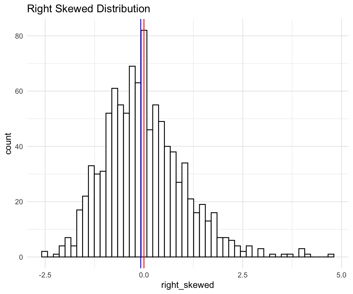
As we can see - there are seems to be a longer tail on the right than on the left. Mean is the red vertical line and median the blue one. This also shows that comparing mean to median might not be a good guide on how skewed the distributions are.
And now we can see in terms of numbers: The mean is 0, and SD is 1 (since I standardized the data beforehand), and there are points as far as 4 SD away on the right, while there are almost no points that are 2 SD away on the left.
Let’s see another example.
# ggplot qqplot
ht <- ggplot(data = distributions) +
    aes(sample = heavy_tailed) +
    theme_minimal() +
    geom_qq() +
    geom_qq_line() +
    labs(title = "Heavy Tailed Distribution")
ht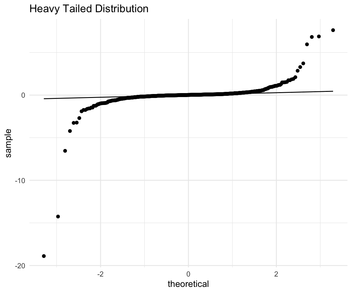
This is a great example of what a heavy tailed distribution can look like, and also why you should not always remove your outliers at the start. It seems that the points are pretty close to a normal except for one observation that is very far off the line. Let’s remove that extreme observation and redo the plot
# ggplot qqplot
distributions %>% filter(heavy_tailed != min(heavy_tailed)) %>%
    ggplot() +
    aes(sample = heavy_tailed) +
    theme_minimal() +
    geom_qq() +
    geom_qq_line() +
    labs(title = "Heavy Tailed Distribution") -> ht
## filter: removed one row (<1%), 999 rows remaininght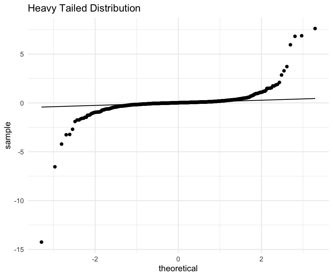
With the point removed, the scaling of the plot changes and we can see that both the right and the left tails are quite far off the line. (And we should keep in mind that we have an extreme observation with a very negative value)
Again the interpretation would go along these lines:
The points on the right side (expected high values) are much higher (above the line) than expected.
The points on the left side (expected low values) are lower than (below the line) than expected.
Combining these two we see that the low values are lower and high values are higher than what we would expect from a normal. This is exactly what we mean when we say “heavy tails” - there are more extreme observations both positive and negative.
Let’s see what a histogram would look like:
# ggplot qqplot
distributions %>% filter(heavy_tailed != min(heavy_tailed)) %>%
    ggplot() +
    aes(x = heavy_tailed) +
    theme_minimal() +
    geom_histogram(bins = 100, fill = "white", color = "black") +
    labs(title = "Heavy Tailed Distribution") +
    geom_vline(xintercept = mean(distributions$heavy_tailed), size = 0.5, color = "red") +
    geom_vline(xintercept = median(distributions$heavy_tailed), size = 0.5, color = "blue") -> ht
## filter: removed one row (<1%), 999 rows remaininght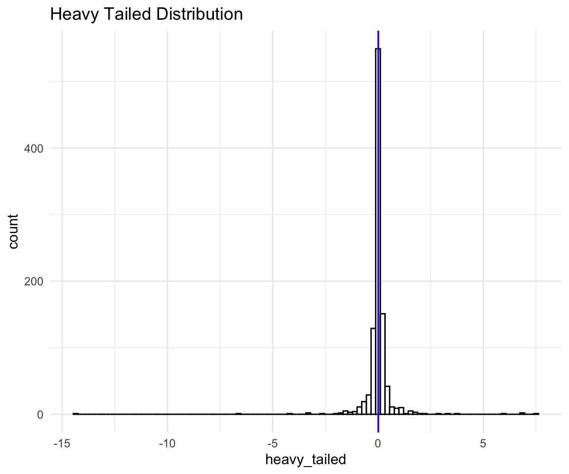
We can see that even with the extreme negative observation removed the scale of the histogram is so wide that it looks like one peak on a bad scale. Let’s see a less extreme example of a heavy tailed distribution:
# ggplot qqplot
ht <- ggplot(data = distributions) +
    aes(sample = heavy_tailed_2) +
    theme_minimal() +
    geom_qq() +
    geom_qq_line() +
    labs(title = "(Less) Heavy Tailed Distribution")
ht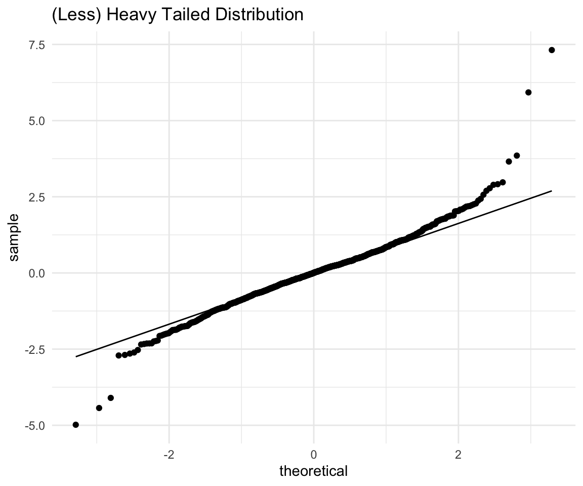
ht <- ggplot(data = distributions) +
    aes(x = heavy_tailed_2) +
    theme_minimal() +
    geom_histogram(bins = 100, fill = "white", color = "black") +
    labs(title = "(Less) Heavy Tailed Distribution") +
    geom_vline(xintercept = mean(distributions$heavy_tailed_2), size = 0.5, color = "red") +
    geom_vline(xintercept = median(distributions$heavy_tailed_2), size = 0.5, color = "blue")
ht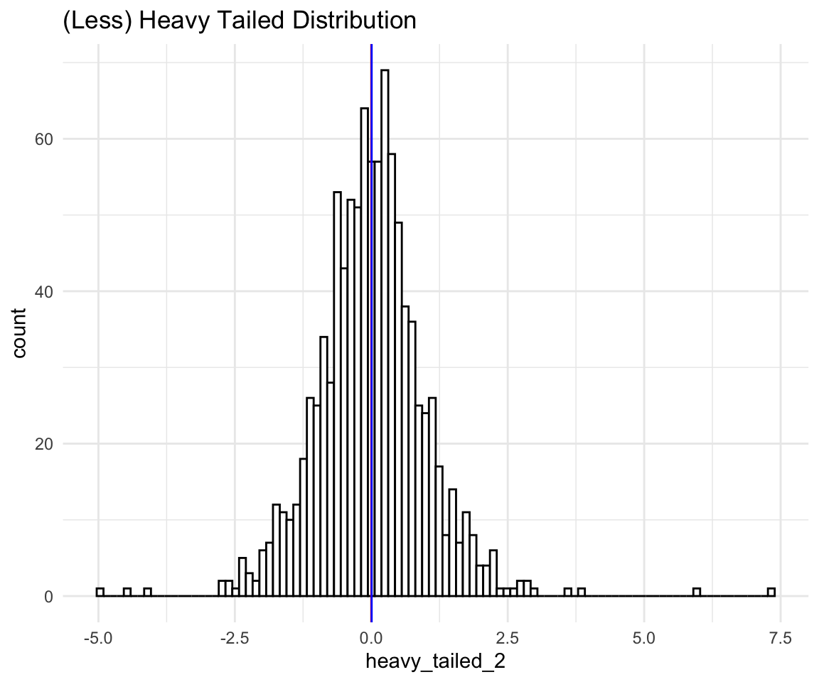
As you can see the histogram seems “Bell shaped” and “Symmetric”, and yet we know that the distribution is (very much) not normal. If we conducted a Shapiro-Wilk Test (which is a test for non-normality), we would learn that the probability of observing a data as extreme as this from a normal distribution is 0 which is pretty much 0.
This is why you should always do some normality checks beyond looking at a histogram, especially when your data looks normal.
Now, for the sake of completion let’s look at a left skewed distribution:
# ggplot qqplot
ls <- ggplot(data = distributions) +
    aes(sample = left_skewed) +
    theme_minimal() +
    geom_qq() +
    geom_qq_line() +
    coord_fixed() +
    labs(title = "Left Skewed Distribution")
ls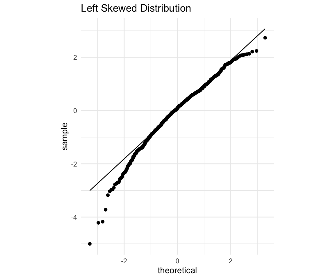
Again, points on the left (expected to be low), fall below the line which means they are even lower than expected, while points on the right (expected to be high) also fall below the line, so they are lower than expected as well. Since both high and low points are lower than expected that means our distribution is skewed to the left. Let’s confirm with a histogram:
# ggplot qqplot
ls <- ggplot(data = distributions) +
    aes(x = left_skewed) +
    theme_minimal() +
    geom_histogram(bins = 100, fill = "white", color = "black") +
    labs(title = "Left Skewed Distribution") +
    geom_vline(xintercept = mean(distributions$left_skewed), size = 0.5, color = "red") +
    geom_vline(xintercept = median(distributions$left_skewed), size = 0.5, color = "blue")
ls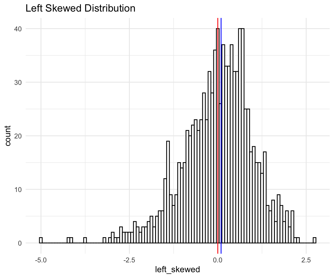
And finally a light tailed distribution:
# ggplot qqplot
lt <- ggplot(data = distributions) +
    aes(sample = light_tailed) +
    theme_minimal() +
    geom_qq() +
    geom_qq_line() +
    labs(title = "Light tailed Distribution")
lt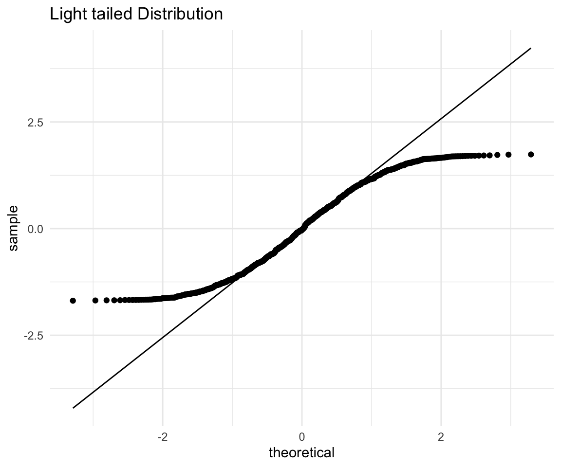
Again, points on the left (expected to be low), fall above the line which means they are higher than expected, while points on the right (expected to be high) fall below the line, so they are lower than expected as well. Now the distribution that has lower points higher than expected and higher points lower than expected (i.e. more squished in the middle), is what we mean when we say “light tailed”.
Let’s confirm with a histogram:
# ggplot qqplot
lt <- ggplot(data = distributions) +
    aes(x = light_tailed) +
    theme_minimal() +
    geom_histogram(bins = 100, fill = "white", color = "black") +
    labs(title = "Light Tailed Distribution") +
    geom_vline(xintercept = mean(distributions$light_tailed), size = 0.5, color = "red") +
    geom_vline(xintercept = median(distributions$light_tailed), size = 0.5, color = "blue")
lt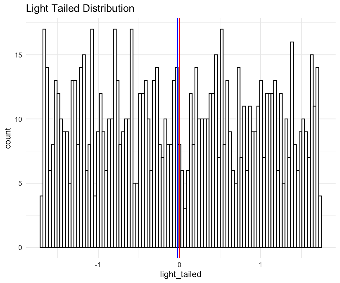
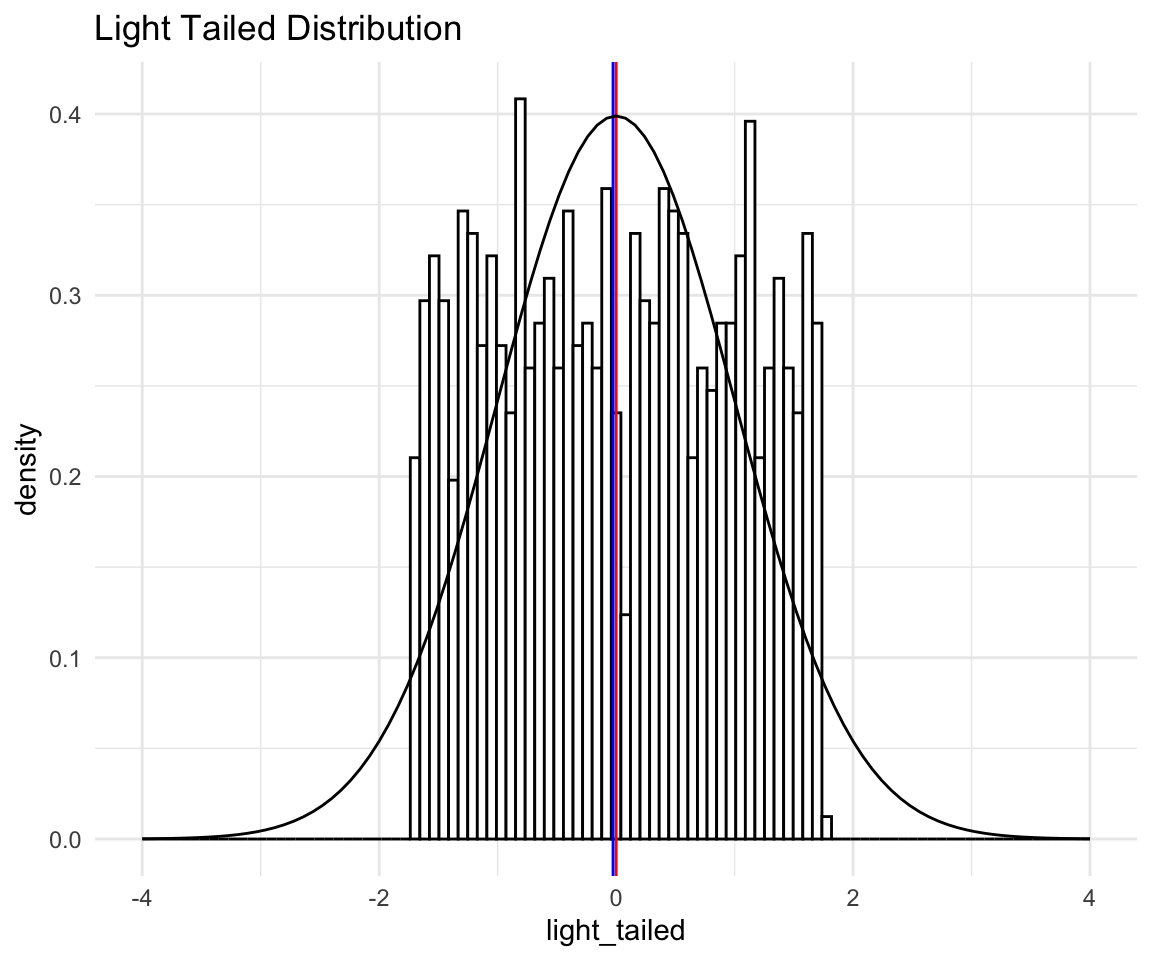
Now, this histogram does not make it seem like we have light tails, since the points are quite spread out, one could even guess that we have heavy tails because there is so much spread. This does not take into account that all of what you see in the histogram is the “peak” of the distribution. The tails are so light that essentially they don’t exist! Again this is more evidence that you should look at more than just the histogram of your data.
To illustrate, I will plot the “light tailed” histogram with normal distribution density overlaid:
# ggplot qqplot
lt <- ggplot(data = distributions) +
    aes(x = light_tailed) +
    theme_minimal() +
    geom_histogram(aes(y = ..density..),bins = 100, fill = "white", color = "black") +
    labs(title = "Light Tailed Distribution") +
    geom_vline(xintercept = mean(distributions$light_tailed), size = 0.5, color = "red") +
    geom_vline(xintercept = median(distributions$light_tailed), size = 0.5, color = "blue") +
    stat_function(fun = dnorm, args = list(mean = mean(distributions$light_tailed),
                                           sd = sd(distributions$light_tailed))) +
    xlim(-4, 4)
lt